Detailed results 

__copyright__ = “© Reiner Lemoine Institut”
__license__ = “GNU Affero General Public License Version 3 (AGPL-3.0)”
__url__ = “ https://www.gnu.org/licenses/agpl-3.0.en.html ”
__authors__ = “ Guido Pleßmann , Jonathan Amme , Julian Endres , “
Only non-interactive plots shown here
We apologise for the fact that the plots in the notebooks are only shown as static graphics due to limited ressources. Executing the notebook locally (using the raw results from zenodo ) enables the interactive plots and will provide more precise information.
Intro 
This jupyter notebook provides plots and information to the results of the dispatch-optimization of one of many scenarios by the study **”A regional energy system model for Anhalt-Bitterfeld-Wittenberg”** . The different scenarios cover various combinations of renewable energy penetration, area restrictions and flexibility options in heat and power sector. The notebooks will, therefore, give an overall view of energy supply and demand by the various scenarios and an insight into scenario-specific distribution and flexiblity effects.
**The representation in jupyter notebooks is intended to ensure transparency and to provide a low entry barrier for further analysis.*
Notes on interactive plots
Even if the web-version only shows static SVG graphics, some notes on interative plots.
-
Some plots are generated with plotly and may not show up initially as Javascript is not enabled by default. This can be solved by clicking File -> “Trust Notebook” .
-
hovering over the plot will display additional infos
-
clicking the legend selects data
Table of Contents 
[1]:
######## WINDNODE ###########
# define and setup logger
from windnode_abw.tools.logger import setup_logger
logger = setup_logger()
# load configs
from windnode_abw.tools import config
config.load_config('config_data.cfg')
config.load_config('config_misc.cfg')
# import scripts
from windnode_abw.analysis import analysis
from windnode_abw.tools.draw import *

######## DATA ###########
import re
import pandas as pd

######## PLOTTING ###########
import matplotlib.pyplot as plt
from mpl_toolkits.axes_grid1 import make_axes_locatable
from matplotlib.ticker import ScalarFormatter
import seaborn as sns
# set seaborn style
sns.set()
# plotly
import plotly.express as px
import plotly.graph_objs as go
from plotly.subplots import make_subplots
import plotly.io as pio
pio.renderers.default = 'svg'
0 Scenario information 
[2]:
# Parameters
scenario = "ISE_DSM_BAT_PTH"
run_timestamp = "2020-08-20_003243"
force_new_results = False
[3]:
# obtain processed results
regions_scns, results_scns = analysis(run_timestamp=run_timestamp,
                                      scenarios=[scenario],
                                      force_new_results=force_new_results)
18:51:42-INFO: Analyzing 1 scenarios...
18:51:42-INFO: Loading processed results from /home/guido/.windnode_abw/results/2020-08-20_003243/ISE_DSM_BAT_PTH/processed ...
Municipality Names 
[4]:
# Names of Municialities
MUN_NAMES = regions_scns[scenario].muns.gen.to_dict()
# extend for total ABW region
MUN_NAMES.update({100:'ABW'})
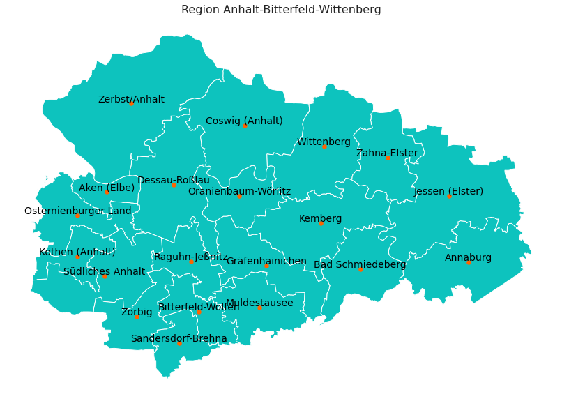
Region Anhalt-Bitterfeld-Wittenberg 
** This function is used for plotting.*
[5]:
plot_grid(regions_scns[scenario])
/home/guido/git/WindNODE_ABW/windnode_abw/tools/draw.py:528: MatplotlibDeprecationWarning:

The 's' parameter of annotate() has been renamed 'text' since Matplotlib 3.3; support for the old name will be dropped two minor releases later.
1 Demand and Generation (Input Data) 
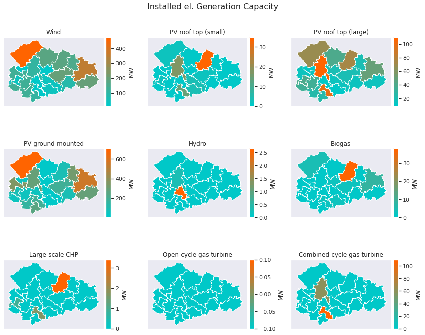
1.1 Installed Electrical Capacities, Municipalities 
The following figure shows the total installed electrical capacities per technology for each municipality.
[6]:
df_data = results_scns[scenario]['parameters']['Installed capacity electricity supply'].copy()
df_data = df_data.rename(columns=PRINT_NAMES)

fig, axes = plt.subplots(3,3, figsize=(12,10))
for ax, (key, data) in  zip(axes.flat, df_data.iteritems()):
    plot_geoplot(key, data, regions_scns[scenario],  cmap=cmap, ax=ax, unit='MW')

fig.suptitle('Installed el. Generation Capacity',
     fontsize=16,
     fontweight='normal')
plt.tight_layout()
plt.show()
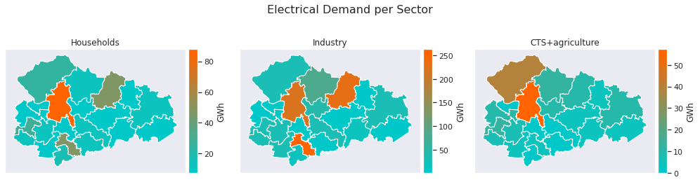
1.2 Electrical Demand 
The following figure shows the total annual electrical demand per sectors for each municipality.
[7]:
df_data = results_scns[scenario]['flows_txaxt']['Stromnachfrage'].sum(level=1)
df_data = df_data.drop(columns='export')
df_data = df_data.rename(columns=PRINT_NAMES)
df_data = df_data / 1e3

fig, axes = plt.subplots(1,3, figsize=(14,4))
for ax, (key, data) in  zip(axes.flat, df_data.iteritems()):
    plot_geoplot(key, data, regions_scns[scenario],  cmap=cmap, ax=ax, unit='GWh')

fig.suptitle('Electrical Demand per Sector',
     fontsize=16,
     fontweight='normal')
plt.tight_layout()
plt.show()
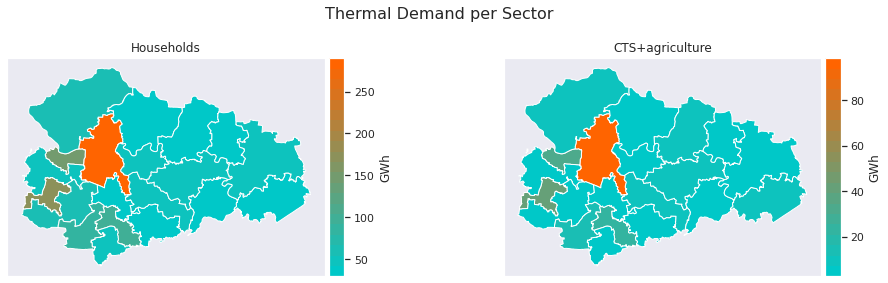
1.3 Thermal Demand 
The following figure shows the total annual thermal demand per sectors for each municipality.
Sector Industry is not considered due to lack of data and the fact that most industries have their own power plants.
[8]:
df_data = results_scns[scenario]['flows_txaxt']['Wärmenachfrage'].sum(level=2)
df_data = df_data.rename(columns=PRINT_NAMES)
df_data = pd.DataFrame([df_data.iloc[:,:2].sum(axis=1).rename('Households'), df_data.iloc[:,-1]]).T
df_data = df_data / 1e3 # to GWh

fig, axes = plt.subplots(1,2, figsize=(14,4))
for ax, (key, data) in  zip(axes.flat, df_data.items()):
    plot_geoplot(key, data, regions_scns[scenario],  cmap=cmap, ax=ax, unit='GWh')

fig.suptitle('Thermal Demand per Sector',
     fontsize=16,
     fontweight='normal')
plt.tight_layout()
plt.show()
1.4 Total installed Capacities, Electricity/Heat in ABW Region 
The following figure shows the total installed capacity per type and technology for the ABW Region.
[9]:
cap_heat = results_scns[scenario]['parameters']['Installed capacity heat supply'].sum(axis=0).rename('heat')
cap_electricity = results_scns[scenario]['parameters']['Installed capacity electricity supply'].sum(axis=0).rename('electricity')
cap = pd.concat([cap_electricity], keys=['Electricity']).append(pd.concat([cap_heat], keys=['Heat']))

cap = cap.rename(index=PRINT_NAMES)
cap = cap.sort_values(ascending=True)

fig = go.Figure()
for color, (key, df) in enumerate(cap.groupby(level=0)):

    visible = True if key == 'Electricity' else 'legendonly'
    fig.add_trace(go.Bar(x=df[key],
                         y=df[key].index,
                         name=key,
                        orientation='h',
                         marker_color=colors[20*color],
                         visible=visible,
                         showlegend=True))

fig.update_layout(title='Total installed Capacities, ABW Region',
                  barmode='stack', legend={'traceorder':'normal'},
                  uniformtext_mode='hide', hovermode="y unified"
                 )
fig.update_traces(hovertemplate='Type: %{fullData.name} <br>' +
                  'Capacity: %{x:.1f} MW <br>'+
                  '<extra></extra>',)
fig.update_xaxes(title_text='MW')
fig.update_yaxes(title_text='')
fig.show()

1.5 Total Generation Heat/Electricity in ABW Region 
The following figure shows the total annual generation per type and technology for the ABW Region.
[10]:
gen_heat = results_scns[scenario]['flows_txaxt']['Wärmeerzeugung'].sum(axis=0).rename('heat')
gen_electricity = results_scns[scenario]['flows_txaxt']['Stromerzeugung'].sum(axis=0).rename('electricity')
gen = pd.concat([gen_electricity], keys=['Electricity']).append(pd.concat([gen_heat], keys=['Heat']))
gen = gen / 1000 # to GWH

gen = gen.rename(index=PRINT_NAMES)
gen = gen.sort_values(ascending=True)

fig = go.Figure()
for color, (key, df) in enumerate(gen.groupby(level=0)):

    visible = True if key == 'Electricity' else 'legendonly'
    fig.add_trace(go.Bar(x=df[key],
                         y=df[key].index,
                         name=key,
                        orientation='h',
                         marker_color=colors[20*color],
                         visible=visible,
                         showlegend=True))

fig.update_layout(title='Generation, ABW Region',
                  barmode='stack', legend={'traceorder':'normal'},
                  uniformtext_mode='hide', hovermode="y unified"
                 )
fig.update_traces(hovertemplate='Type: %{fullData.name} <br>' +
                  'Energy: %{x:.1f} GWh <br>'+
                  '<extra></extra>',) #
fig.update_xaxes(title_text='GWh')
fig.update_yaxes(title_text='')
fig.show()

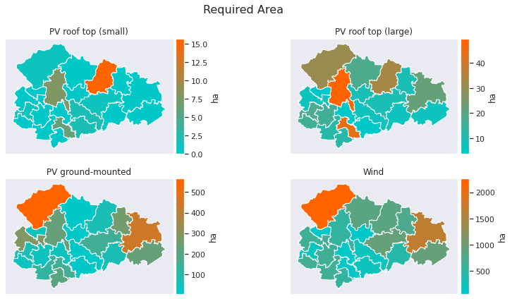
2 Area required by RES 
2.1 Absolute Area 
The following figure shows the absolute area required of RES by technology in ABW.
For status quo the required area for ground-mounted PV and wind turbines is unknown and therefore not displayed.
[11]:
df_data = results_scns[scenario]['results_axlxt']['Area required'].copy()

# drop pv ground and wind areas for status quo
if regions_scns[scenario].cfg['scn_data']['general']['year'] == 2017:
    df_data.drop(columns=['pv_ground', 'wind'], inplace=True)
    plt_count_y = 1
else:
    plt_count_y = 2

df_data = df_data.rename(columns=PRINT_NAMES)

fig, axes = plt.subplots(plt_count_y, 2, figsize=(12,6))

for ax, (key, data) in  zip(axes.flat, df_data.iteritems()):
    plot_geoplot(key, data, regions_scns[scenario],  cmap=cmap, ax=ax, unit='ha')

fig.suptitle('Required Area',
     fontsize=16,
     fontweight='normal')
plt.tight_layout()
plt.show()
2.2 Relative Area 
The following figure focuses on the area conflicts between RES technologies and agriculture, forests, settlements. It shows the relative area required by RES compared to the available areas for different land use scenarios.
Technology-specific naming conventions of land use scenarios:
Wind
-
Distance to settlements (500m/1000m)
-
use of forests (with: w / without: wo)
-
percentage of available area due to restrictions resulting from case-by-case decisions (10%)
PV ground
-
Restrictions that apply (hard: H / hard+soft: HS)
-
percentage of total available agricultural area as upper limit (0.1% / 1%)
PV rooftop
-
Percentage of total potential (50% / 100%)
[12]:
df_data = results_scns[scenario]['highlevel_results'].copy()

fig = go.Figure()

# PV rooftop
mask = [i for i in df_data.index if 'rel. PV rooftop' in  i[0]]
data = df_data.loc[mask]
index = data.index.get_level_values(level=0)

fig.add_trace(
    go.Bar(y=index, x=data.values,
           orientation='h',
           name='PV rooftop',
           marker_color=colors[20]))

# PV Ground
mask = [i for i in df_data.index if 'rel. PV ground' in  i[0]]
data = df_data.loc[mask]
data.index = data.index.get_level_values(0).str.replace('Area required rel. PV ground \(THIS SCENARIO\)',
                                                        '<b>Area required rel. PV ground (THIS SCENARIO)</b>')
index = data.index.get_level_values(level=0)

fig.add_trace(
    go.Bar(y=index, x=data.values,
           orientation='h',
           name='PV Ground',
           marker_color=colors[10]))#, visible='legendonly'))

# Wind
mask = [i for i in df_data.index if 'rel. Wind' in  i[0]]
data = df_data.loc[mask]
data.index = data.index.get_level_values(0).str.replace('Area required rel. Wind \(THIS SCENARIO\)',
                                                        '<b>Area required rel. Wind (THIS SCENARIO)</b>')
index = data.index.get_level_values(level=0)

fig.add_trace(
    go.Bar(y=index, x=data.values,
           orientation='h',
           name='Wind',
           marker_color=colors[0]))#, visible='legendonly'))

fig.update_layout(title_text = 'Relative Required Area',
                  xaxis=dict(title=' %',
                    titlefont_size=12),
                    autosize=True)

fig.show()

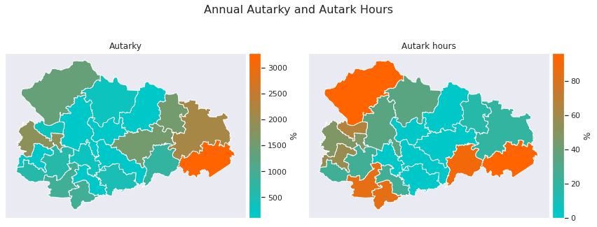
3 Electrical Autarky and Exchange 
Annual Autarky describes the ratio of the electricity gerneration to the demand within the region Anhalt-Bitterfeld-Wittenberg (ABW). A distinction is made depending on the spatial resolution:
Calculating the degree of autarky
-
-
Annual Autarky (ABW): degree of autark electricity supply for ABW disregarding dimension of time
\[Autarky_{Annual,ABW,\%} = \frac{\sum_{t=1}^{8760} E_{supply,mun,t}}{\sum_{t=1}^{8760} E_{demand,mun,t}} \cdot 100\,\%\] -
-
-
Annual Autarky (Municipality): degree of autark electricity supply per municipality disregarding dimension of time
\[Autarky_{Annual,mun,\%} = \frac{\sum_{t=1}^{8760} E_{supply,ABW,t}}{\sum_{t=1}^{8760} E_{demand,ABW,t}} \cdot 100\,\%\] -
A further perspective results from the percentage of hours in a year at which the electricity demand is entirely served by local supply. A distinction is again made depending on the spatial resolution:
Calculation of autark hours
-
(3) Autarky (ABW):
\[Autark\,hours_{Annual,ABW,\%} = \frac{\sum_{t=1}^{8760} (\frac{E_{supply,ABW,t}}{E_{demand,ABW,t}} \geq 1)}{8760} \cdot 100\,\%\]
-
(4) Autarky (Municipality):
\[Autark\,hours_{Annual,mun,\%} = \frac{\sum_{t=1}^{8760} (Autarky_{mun,t} \geq 1)}{8760} \cdot 100\,\%\]
where degree of autarky electricity supply per municipality for each hour is defined as
where:
-
\(E_{import,ext,t}\) , \(E_{export,ext,t}\) : Imported/exported energy from/to national grid
-
\(E_{import,reg,t}\) , \(E_{export,reg,t}\) : Imported/exported energy from/to region’s grid (intra-regional)
-
\(E_{bat,discharge,t}\) : Battery discharge
-
\(E_{demand,t}\) : Electrical demand
-
\(E_{bat,charge,t}\) : Battery charge
The electricity that exceeds the local demand can be distributed to the neighboring municipalities and thus contributes to the degree of Autarky of the entire region.
3.1 Autarky Geoplots 
The following figure shows both the Annual Autarky and the Autark Hours for each municipality with equation (1) and (3) .
[13]:
df_data = pd.concat([results_scns[scenario]['results_axlxt']['Autarky'].rename('Autarky'), results_scns[scenario]['results_axlxt']['Autark hours'].rename('Autark hours')], axis=1)

fig, axes = plt.subplots(1,2, figsize=(12,5))

for ax, (key, data) in  zip(axes.flat, df_data.iteritems()):

    plot_geoplot(key, data, regions_scns[scenario],  cmap=cmap, ax=ax, unit="%")

fig.suptitle('Annual Autarky and Autark Hours',
     fontsize=16,
     fontweight='normal')
plt.tight_layout()
plt.show()
3.2 Autarky anually 
The following figure shows the Annual Autarky and the Autark Hours in a more detailed and comparative representation with equations (1 - 4) .
[14]:
fig = make_subplots(rows=1, cols=2, horizontal_spacing=0.17, column_widths=[0.8, 0.2],
                    specs=[[{"secondary_y": True}, {"secondary_y": True}]])

# For each municipality
fig.add_trace(
    go.Bar(
        x=results_scns[scenario]['results_axlxt']['Autarky'].rename(index=MUN_NAMES).index.tolist(),
        y=results_scns[scenario]['results_axlxt']['Autarky'].values.tolist(),
           orientation='v',
           name='Annual Autarky',
        offsetgroup=0,
           marker_color=colors[0],
         hovertemplate='Annual Autarky: %{y:.1f} % <extra></extra>'),
    row=1, col=1, secondary_y=False,)

fig.add_trace(
    go.Bar(
        x=results_scns[scenario]['results_axlxt']['Autark hours'].rename(index=MUN_NAMES).index.tolist(),
        y=results_scns[scenario]['results_axlxt']['Autark hours'].values.tolist(),
           orientation='v',
           name='Autark hours',
        offsetgroup=1,
           marker_color=colors[20],
        hovertemplate='Autark Hours: %{y:.1f} % of year <extra></extra>'),
    row=1, col=1, secondary_y=False,)


# For entire ABW region
fig.add_trace(
    go.Bar(x=["Annually", "Autark supplied hours"],
           y=[float(results_scns[scenario]['highlevel_results']['Autarky']),
              float(results_scns[scenario]['highlevel_results']['Autark hours'])],
           orientation='v',
           name='ABW avg.',
           marker_color=colors[4],
          ),
    row=1, col=2, secondary_y=False,)

# === Layout ===
fig.update_layout(title_text = 'Electrical Autarky per Municipality (Energy Balance) and total region',
                    autosize=True,
                hovermode="x unified",
                  legend=dict(orientation="h",
                                yanchor="bottom",
                                y=1.02,
                                xanchor="right",
                                x=1),
                 )
fig.update_yaxes(title_text="%", row=1, col=1, anchor="x", secondary_y=False)
fig.update_yaxes(title_text="%", row=1, col=2, anchor="x2", secondary_y=False)

3.3 Intra-regional Exchange Balance 
The following figure shows the annual electricity exchange balance for each municipality.
[15]:
df_data = results_scns[scenario]['results_axlxt']['Intra-regional exchange'].copy()
df_data = df_data.rename(index=MUN_NAMES)
df_data = df_data / 1e3 # GWh

fig = go.Figure()

fig.add_trace(go.Bar(x=df_data.index, y=df_data['export'].values,
                base=0,
                marker_color=colors[20],
                name='export',
                hovertemplate='%{y:.1f} GWh ',
                ))


fig.add_trace(go.Bar(x=df_data.index, y=df_data['import'].values,
                base=0,
                marker_color=colors[0],
                name='import',
                hovertemplate='%{y:.1f} GWh ',
                ))
fig.update_layout(title='Annual net electricity exchanges among administrive districts within ABW region',
                 hovermode="x unified")
fig.update_xaxes(type='category', tickangle=45)
fig.update_yaxes(title='GWh')
fig.show()

3.4 Degree of autarky distribution 
The following 2 figures give information about the frequency distribution of the respective degree of autarky. First, we look at the distribution as average over the entire region with equation (5) .
[16]:
df_data = results_scns[scenario]['flows_txaxt']['Autarky'].mean(level="timestamp")

fig = go.Figure()
fig.add_trace(
    go.Violin(x=df_data.values,
              name="ABW average",
              orientation='h',
              fillcolor=colors[0],
              line_color='darkslategrey',
              box_visible=True,
              meanline_visible=True,
              showlegend=False)
)
fig.update_xaxes(title='%')

Secondly, the degree of autarky may vary significantly among the municipalities with equation (5) .
Negative Autarky can be a result of high imports while having low local generation and export activity.
**By selecting individual municipalities in the legend at the right a more detailed view can be used.*
[17]:
df_data = results_scns[scenario]['flows_txaxt']['Autarky'].unstack()

df_data = df_data.rename(columns=MUN_NAMES)

limit = df_data.median().mean()

fig = make_subplots(rows=2, cols=2, horizontal_spacing=0.25,
                    row_heights=[0.8, 0.2],
                    specs=[[{}, {}], [{"colspan": 2}, None]],)

for ags, data in df_data.iteritems():

    if data.median() > limit:

        fig.add_trace(go.Violin(x=data.values, name=ags,
                                orientation='h',
                               line_color=colors[0],
                                points=False,
                                hoverinfo='x',
                                showlegend=False),

                      row=1, col=1)
    else:
        fig.add_trace(go.Violin(x=data.values, name=ags,
                                orientation='h',
                               line_color=colors[0],
                                points=False,
                                hoverinfo='x',
                               showlegend=False),
                      row=1, col=2)

    fig.add_trace(go.Violin(x=data.values, name=ags,
                                orientation='h',
                               line_color=colors[20],
                               box_visible=True,
                            meanline_visible=True,
                            hoverinfo='x',
                               showlegend=True,
                           visible='legendonly'),

                      row=2, col=1)

fig.update_layout(title='Relative Electrical Autarky per Municipality (Energy Balance)',)
fig.update_xaxes(title_text="%", side='bottom', row=2, col=1)
fig.update_yaxes(type='category', row=1, col=1)
fig.update_yaxes(type='category', row=1, col=2)
fig.show()

3.5 Heatmap Electricity Exchange 
The following figure shows the positive exchanged electricity between the municipalities.
Only the electricity exchange between neighbouring municipalities can be detected thus transit electricity is not listed seperatly.
[18]:
df_data = results_scns[scenario]['results_axlxt']['Stromnetzleitungen'].copy()

# swap index of negative values
invert = df_data.loc[df_data['in']<0]
invert.index = invert.index.swaplevel()
invert.index.names = (['ags_from', 'ags_to'])
df_data = df_data.loc[df_data['in']>0].append(invert * -1)

df_data = df_data['out']
df_data = df_data.sort_index()
df_data = df_data / 1e3 # GWh

hover_text = [f' From: {MUN_NAMES[int(ags_from)]} <br> \
To: {MUN_NAMES[int(ags_to)]} <br> \
Value: {round(value,2)} GWh' for (ags_from, ags_to), value in df_data.items()]

y = df_data.index.get_level_values(level='ags_from')
y = pd.Series(y.astype(int).values).map(MUN_NAMES).values

x = df_data.index.get_level_values(level='ags_to')
x = pd.Series(x.astype(int).values).map(MUN_NAMES).values

fig = go.Figure(go.Heatmap(
    x=x,
    y=y,
    z=df_data.values,
    colorbar=dict(title='GWh'),
    colorscale=colors,
    text= hover_text,
    hoverongaps=False,
    hovertemplate='%{text}<extra></extra>'
))
fig.update_layout(title='Intra Regional Electricity Exchange')
fig.update_yaxes(title='from', type='category')
fig.update_xaxes(title='to', type='category')
fig.show()

3.6 Electricity Flows 
The following figure shows the incoming and outcoming electricity flows of the municipalities.
The difference between incoming and outcoming flows can either be local excess generation, not covered local demand or transmission to the higher grid level. These amounts are not listed seperatly.
[19]:
df_data = results_scns[scenario]['results_axlxt']['Stromnetzleitungen'].copy()
invert = df_data.loc[df_data['in']<0]
invert.index = invert.index.swaplevel()
invert.index.names = (['ags_from', 'ags_to'])
df_data = df_data.loc[df_data['in']>0].append(invert * -1)
df_data = df_data / 1e3 # GWh

converter = dict(zip(MUN_NAMES.keys(), range(20)))
source = [converter[int(i)] for i in df_data['out'].index.get_level_values(level='ags_from')]
target = [converter[int(i)] for i in df_data['out'].index.get_level_values(level='ags_to')]

fig = go.Figure(data=[go.Sankey(
    node = dict(
        pad = 40,
        thickness = 20,
        line = dict(
            color = "black", width = 0.4),
        label = [MUN_NAMES[i] for i in list(converter)],
        color = "silver",
        hovertemplate='<extra></extra>',
    ),
    link = dict(
        source = source,
        target = target,
        value = df_data['out'].values,
        color = [i for i in colors],
        hovertemplate='From: %{source.label}<br />'+
            'To: %{target.label}<br />'+
            'Value: %{value:.2f} GWh <extra></extra>',
  ))])

fig.update_layout(title_text="Electricity Flows",
                  font_size=12,
                  hovermode='x')
fig.show()

4 Energy Mix 
4.1 Region’s sum 
4.1.1 Elecricity 
The following figure shows the annual electricity balance by supply and demand technology.
The difference between supply and demand is due to efficiency loses of battery storages, grid and transformers.
[20]:
idx = ['Supply', 'Demand']
df_el = pd.DataFrame([results_scns[scenario]['results_axlxt']['Stromerzeugung nach Gemeinde'].sum(),
                   pd.concat([results_scns[scenario]['results_axlxt']['Stromnachfrage nach Gemeinde'].sum(),
                  results_scns[scenario]['results_axlxt']['Stromnachfrage Wärme nach Gemeinde'].sum()])], index=idx)
df_el = df_el  / 1e3 # GWh
colors_el = [COLORS[c] for c in df_el.columns]
df_el = df_el.rename(columns=PRINT_NAMES)

fig = px.bar(df_el, orientation='v',
             title='Electricity supply and demand in ABW region',
             color_discrete_sequence=colors_el)

fig.update_layout(barmode='stack', legend={'traceorder':'reversed'},
                  uniformtext_mode='hide',
                  autosize=True,
                  legend_title="technology",
                 )
fig.update_traces(hovertemplate='%{fullData.name}<br>'+
                  '%{y:.1f} GWh <br>'+
                  '<extra></extra>',)
fig.update_yaxes(title_text='GWh')
fig.update_xaxes(title_text='')

4.1.2 Heat 
The following figure shows the annual heat balance by supply and demand technology.
The difference between supply and demand is dissipative energy due to efficiency loses.
[21]:
idx = ['Supply', 'Demand']
df_th = pd.DataFrame([results_scns[scenario]['results_axlxt']['Wärmeerzeugung nach Gemeinde'].sum(),
                   results_scns[scenario]['results_axlxt']['Wärmenachfrage nach Gemeinde'].sum()], index=idx) / 1e3

colors_heat = [COLORS[c] for c in df_th.columns]
df_th = df_th.rename(columns=PRINT_NAMES)

fig = px.bar(df_th, orientation='v',
             title='Heat supply and demand in ABW region',
             color_discrete_sequence=colors_heat)

fig.update_layout(barmode='stack', legend={'traceorder':'reversed'},
                  uniformtext_mode='hide',
                  autosize=True,
                  legend_title="technology",
                 )
fig.update_traces(hovertemplate='%{fullData.name}<br>'+
                  '%{y:.1f} GWh <br>'+
                  '<extra></extra>',) #
fig.update_yaxes(title_text='GWh')
fig.update_xaxes(title_text='')

4.2 Balance 
The following figure shows the annual electricity balance by supply technology and demand sector per municipality.
**The demand needs to be activated by clicking in the legend*
The difference between supply and demand are due to efficiency loses.
** This function is used for plotting.*
[22]:
supply = results_scns[scenario]['flows_txaxt']['Stromerzeugung'].sum(level=1)
abw_import = results_scns[scenario]['flows_txaxt']['Intra-regional exchange']['import'].sum(level=1)
abw_import = abw_import.rename('ABW-import')
supply = supply.join(abw_import)


demand = results_scns[scenario]['flows_txaxt']['Stromnachfrage'].sum(level=1)
abw_export = results_scns[scenario]['flows_txaxt']['Intra-regional exchange']['export'].sum(level=1)
abw_export = abw_export.rename('ABW-export')
demand = demand.join(abw_export)
el_heating = results_scns[scenario]['flows_txaxt']['Stromnachfrage Wärme'].sum(level=2).sum(axis=1)
demand = demand.join(el_heating.rename('el_heating'))

plot_snd_total(regions_scns[scenario], supply , demand)

4.3 Full load hours 
The following figure shows the full load hours of the several power generation technologies.
[23]:
df = (results_scns[scenario]['flows_txaxt']['Stromerzeugung'].drop(columns='import').sum(level=1).sum(axis=0) /
      results_scns[scenario]['parameters']['Installed capacity electricity supply'].sum(axis=0)).fillna(0)

df = df.rename(index=PRINT_NAMES)
df = df.sort_values(ascending=True)

fig = px.bar(df, orientation='h',
             title='Full Load Hours',
             color='value',
             color_continuous_scale=colors,
            )
fig.update_layout(barmode='stack', showlegend=False, legend={'traceorder':'reversed'},
                  uniformtext_mode='hide'#, hovermode="y unified"
                 )
fig.update_traces(hovertemplate='%{y}<br>'+
                  'FLH: %{x:.0f} h <br>'+
                  '<extra></extra>',) #
fig.update_xaxes(title_text='h')
fig.update_yaxes(title_text='')
fig.show()

4.4 Timeseries 
The following figures show both power and thermal generation and equivalent demand timeseries.
**The plotting function can be found here *
[24]:
plot_timeseries(results_scns[scenario], kind='Power')

[25]:
plot_timeseries(results_scns[scenario], kind='Thermal')

5 Emissions 
The emissions of the Combined-Cycle powerplants are fully attributed to the power sector.
5.1 Overview 
The following figure shows the emissions in each sector per technology proportional to the total emissions.
_*The Figure is interactive, technologies can be selected by clicking._
_* This function is used to organize the data in the right format._
[26]:
df_data = get_emissions_sb_formated(results_scns[scenario])

fig = px.sunburst(df_data,
                  path=['sector', 'technology', 'type'],
                  maxdepth=2,
                  values='emissions',
                  color='sector',
                  color_discrete_map={'Power': colors[0], 'Grid': colors[10], 'Heat': colors[20]},
                 )
fig.update_layout(title='CO2 Emissions per Technology',
                  uniformtext=dict(minsize=14, mode='hide'))
fig.update_traces(hovertemplate='<b>%{label} </b> <br>'+
                  'Emissions: %{value:0.1f} t CO2<br>')
fig.show()

5.2 Emissions per Sector 
The following figure compares the emissions of thermal and electrical sector per technology .
[27]:
df_data_left = results_scns[scenario]['results_t']['CO2 emissions th. total'].rename('th').to_frame()
df_data_right = results_scns[scenario]['results_t']['CO2 emissions el. total'].rename('el').to_frame()

# drop nans & zeros
df_data_left = df_data_left[df_data_left!=0].dropna()
df_data_right = df_data_right[df_data_right!=0].dropna()

df_data = df_data_left.join(df_data_right, how='outer')
df_data = df_data.fillna(0).T
df_data = df_data.sort_values(by=list(df_data.index), axis=1, ascending=True)
#df_rel = df_data.T / df_data.sum(axis=1).values

fig = px.bar(df_data, orientation='h',
             color_discrete_sequence=[COLORS_PRINT[i] for i in df_data.columns],
             text=df_data.sum(axis=1).to_list()
            )


fig.update_layout(barmode='stack',
                  autosize=True,
                  title='CO2 Emissions',
                  legend={'traceorder':'reversed'},
                 uniformtext_mode='hide')
fig.update_traces(hovertemplate='CO2: %{x:.1f} t <br>Type: %{y}<br>Total: %{text:.1f} t') #
fig.update_xaxes(title_text='t CO2')
fig.update_yaxes(title_text='')
fig.show()

5.3 Emissions per Sector and Type 
The following figure compares the emissions per technologies in each sector.
_* This function is used to organize the data in the right format._
[28]:
df_data = get_emissions_type_formatted(results_scns[scenario])

for sector, df in df_data.groupby(level=0, axis=1):
    df = df[(df!=0).any(axis=1)]
    if df.sum().sum() != 0:

        fig = go.Figure()
        for i, (cat, data) in enumerate(df[sector].items()):
            fig.add_trace(go.Bar(x=data.index,
                                 y=data,
                                 name=cat,
                                 marker_color=colors[20*i],
                                 hovertemplate='%{y:.1f} t CO2',
                                ))

        fig.update_layout(
            title=f'CO2 Emissions of {sector}',
            barmode='stack',
            hovermode="x unified",
            height=600,
            xaxis={'categoryorder':'category ascending'},
            xaxis_tickfont_size=14,
            yaxis=dict(title='t CO2',
                       titlefont_size=16,
                       tickfont_size=14),
                       autosize=True)
        fig.show()
    else:
        print(f'no emissions in sector {sector}!')

no emissions in sector Heat Supply!
6 Costs 
6.1 LCOE and LCOH 
The following figure shows the composition of LCOE and LCOH by technologies.
Notes on LCOE calculation
-
Total LCOE calculate as \(LCOE=\frac{expenses_{el.total}}{demand_{el.,total}}\) , likewise total LCOH calculate as \(LCOH=\frac{expenses_{th.,total}}{demand_{th.,total}}\)
-
Total expenses \(expenses_{el.total}\) are annual expenses. Investment costs are discounted to one year using equivalent periodic costs
-
The plot below shows fractions of these LCOE that are calculated as \(LCOE_{technology}=\frac{expenses_{el.,technology}}{demand_{el.,total}}\) representation the share of each technology at total cost of one MWh
[29]:
values = ['LCOE','LCOH']

df = pd.DataFrame([results_scns[scenario]['results_t'][i] for i in values], index=values)
df = df.rename(columns=PRINT_NAMES)
df = df.sort_values(by=values, axis=1, ascending=True)

fig = px.bar(df, orientation='h',
             title='LCOE and LCOH',
             color_discrete_sequence=[COLORS_PRINT[i] for i in df.columns],
             text=df.sum(axis=1).to_list())

fig.update_layout(barmode='stack', legend={'traceorder':'reversed'},
                  uniformtext_mode='hide'#, hovermode="y unified"
                 )
fig.update_traces(hovertemplate='<b>%{fullData.name}</b><br>'+
                  'Type: %{y}<br>'+
                  'Share: %{x:.1f} €/MWh <br>'+
                  'Total: %{text:.1f} €/MWh'+
                  '<extra></extra>',) #
fig.update_xaxes(title_text='€/MWh')
fig.update_yaxes(title_text='')
fig.show()

6.2 Costs per Sector and Type 
The following figures compare the supply side cost factors of the various technologies in electricity and heat sector.
[30]:
# Electricity
data_el = pd.DataFrame({
    'fix': results_scns[scenario]['results_axlxt']['Fix costs el.'].sum(axis=0),
    'var': results_scns[scenario]['results_axlxt']['Variable costs el.'].sum(axis=0),
    'certificats': results_scns[scenario]['results_axlxt']['CO2 certificate cost el.'].sum(axis=0)
})

data_el.loc['Grid','fix'] = results_scns[scenario]['results_axlxt']['Total costs lines'].sum(axis=0) + \
results_scns[scenario]['results_axlxt']['Total costs line extensions'].sum(axis=0)
# Heat
data_th = pd.DataFrame({
    'fix': results_scns[scenario]['results_axlxt']['Fix costs th.'].sum(axis=0),
    'var': results_scns[scenario]['results_axlxt']['Variable costs th.'].sum(axis=0),
    'certificats': results_scns[scenario]['results_axlxt']['CO2 certificate cost th.'].sum(axis=0)
})

# concat
df_data = pd.concat([data_el, data_th], axis=1,
                    keys=['Electricity Supply', 'Heat Supply'],sort=True)

df_data = df_data.fillna(0)
#df_data = df_data[(df_data!=0).any(axis=1)]
df_data = df_data.rename(index=PRINT_NAMES)
df_data = df_data/ 1e6

for sector, df in df_data.groupby(level=0, axis=1):
    df = df[(df!=0).any(axis=1)]
    if df.sum().sum() != 0:

        fig = go.Figure()
        for i, (cat, data) in enumerate(df[sector].items()):
            fig.add_trace(go.Bar(x=data.index,
                                 y=data,
                                 name=cat,
                                 marker_color=colors[10*i],
                                 hovertemplate='%{y:.1f} M€'
                                ))

        fig.update_layout(
            title=f'Costs of {sector}',
            hovermode="x unified",
            barmode='stack',
            height=600,
            xaxis={'categoryorder':'category ascending'},
            xaxis_tickfont_size=14,
            yaxis=dict(title='million €',
                       titlefont_size=16,
                       tickfont_size=14),
                       autosize=True)
        fig.show()
    else:
        print(f'no Costs in sector {sector}!')


7 Power Grid 
Some municipalites are interconnected with multiple power lines. In this case, the lines are reduced to the maximum value per timesteps per municipality.
7.1 Maximum Line Loading 
The following figure shows the annual maximum load of all lines and the remaining capacity.
[31]:
df_data = results_scns[scenario]['flows_txaxt']['Line loading'].max(level=['ags_from','ags_to']) * 100
df_data = df_data.sort_index(ascending=False)
df_data = pd.DataFrame().from_dict({'line loading': df_data,'free capacity': 100-df_data})


ags_from, ags_to = list(zip(*df_data.index))
ags_from = [s.replace(re.findall(r"\d+",s)[0], MUN_NAMES[int(re.findall(r"\d+",s)[0])]) for s in ags_from]
ags_to = [s.replace(re.findall(r"\d+",s)[0], MUN_NAMES[int(re.findall(r"\d+",s)[0])]) for s in ags_to]

df_data.index = pd.MultiIndex.from_tuples(zip(*(ags_from, ags_to)))

df_data.index = [f'{ags_from} -> {ags_to}' for ags_from, ags_to in df_data.index]
#index = [re.split(r'(\d+)', s) for s in df_data.index]
#df_data.index = [f"{start}{MUN_NAMES[int(ags)]}{end}" for start,ags,end in index]
fig = go.Figure()
for i, (key, df) in enumerate(df_data.items()):

    fig.add_bar(y=df.index,
                x=df.values,
                orientation='h',
                name=key,
                marker_color=list(reversed(colors))[20*i],
                hovertemplate='%{x:.2f} %',
                showlegend=False)
fig.update_layout(barmode="relative",
    title='Maximum Line Loading',
    yaxis_tickfont_size=12,
    xaxis=dict(
        title='Loading in %',
        titlefont_size=16,
        tickfont_size=12,
    ))
fig.update_yaxes(type='category')#,  tickangle=45)
fig.update_xaxes(showspikes=True)
fig.update_layout(hovermode="y unified", height=700)
fig.show()

7.2 Line Loading Distribution 
The following figure shows the frequency distribution of the line loading factor.
[32]:
df_data = results_scns[scenario]['flows_txaxt']['Line loading'].copy()
df_data = df_data * 100
ags_from, ags_to, timestamp = list(zip(*df_data.index))
ags_from = [s.replace(re.findall(r"\d+",s)[0], MUN_NAMES[int(re.findall(r"\d+",s)[0])]) for s in ags_from]
ags_to = [s.replace(re.findall(r"\d+",s)[0], MUN_NAMES[int(re.findall(r"\d+",s)[0])]) for s in ags_to]

df_data.index = pd.MultiIndex.from_tuples(zip(*(ags_from, ags_to, timestamp)))
fig = go.Figure()
for group, data in df_data.groupby(level=[0,1]):
    fig.add_trace(go.Violin(
        x=data.values,
        name=f'{group[0]} -> {group[1]}',
        marker_color=colors[3],
        showlegend=False))

fig.update_layout(
    title='Line Loading Distribution',
    xaxis_title='%',
    height=800,)

fig.update_traces(orientation='h', side='positive', width=2, points=False)
fig.update_layout(xaxis_showgrid=False, xaxis_zeroline=False)
fig.update_xaxes(showspikes=True)
fig.show()

8 Flexibility 
Notes on the Calculation of storage ratios:
To compare/show the usage of different flexibility options 3 different ratios are used:
-
-
Total Cycles:
-
-
-
Utilization Rate:
-
<li> <b>1. Full Discharge Hours:</b> </li>
The Ratio of discharged energy \(E_{tech, discharge}\) to nominal discharge power \(P_{n, discharge}\)
The Ratio of discharged energy \(E_{tech, discharge}\) to installed capacity \(C_{technology}\)
The Ratio of \(Total\,Cycles_{technology}\) to \(Max\,Cycles_{technology}\)
with
and
8.1 Heat Storage 
The following figure show the above declared storage ratios for heat storages.
Notes on Heatstorage Charts
-
Relative cycles will not be used for comparison. This is due to a high c-rate (6.7) of small, decentralised storages which makes the relative usage using eq. full cycles not very meaningful.
-
To show the total cycles, only the discharge values are chosen as the storage losses are almost negligible.
-
If no small or large storages are installed in a scenario, they cannot be evaluated. This will result in empty charts.
** This function is used for plotting.*
[33]:
heat_storage_figures = results_scns[scenario]['results_axlxt']["Heat Storage Figures"]
overview = heat_storage_figures.sum().unstack()
overview = overview.join(overview.sum(axis=1).rename('Total'))
mindex = list(zip(overview.index,['MWh','MW', 'MW']))
overview.index = pd.MultiIndex.from_tuples(mindex, names=['variable', 'unit'])
display(overview.round())
| cen | dec | Total | ||
|---|---|---|---|---|
| variable | unit | |||
| capacity | MWh | 799.0 | 372.0 | 1171.0 |
| power_discharge | MW | 80.0 | 2494.0 | 2574.0 |
| discharge | MW | 230897.0 | 86097.0 | 316994.0 |
[34]:
heat_storage_ratios = results_scns[scenario]['results_axlxt']["Heat Storage Ratios"]
heat_storage_ratios = heat_storage_ratios.drop(columns=[('dec', 'Utilization Rate')])

plot_storage_ratios(heat_storage_ratios, regions_scns[scenario], title='Heat storage')

8.2 Battery Storage 
The following figure show the above declared storage ratios for battery storages.
Notes on Battery Storage Charts
-
The average total cycles (get visible when activating “ABW” in legend) are calculated as mean of total cycles from each municipality.
-
To show the total cycles, only the discharge values are chosen. The difference between charge and discharge results from losses and are somewhat negligible.
-
If no small or large storages are installed in a scenario, they cannot be evaluated. This will result in empty charts.
** This function is used for plotting.*
8.2.1 Utilization 
[35]:
battery_storage_figures = results_scns[scenario]['results_axlxt']["Battery Storage Figures"]

overview = battery_storage_figures.sum().unstack()
overview = overview.join(overview.sum(axis=1).rename('Total'))
mindex = list(zip(overview.index,['MWh','MWh', 'MWh','MW', 'MW']))
overview.index = pd.MultiIndex.from_tuples(mindex, names=['variable', 'unit'])
display(overview.round())
| large | small | Total | ||
|---|---|---|---|---|
| variable | unit | |||
| capacity | MWh | 2400.0 | 0.0 | 2400.0 |
| charge | MWh | 706.0 | NaN | 706.0 |
| discharge | MWh | 608.0 | NaN | 608.0 |
| power_charge | MW | 600.0 | 0.0 | 600.0 |
| power_discharge | MW | 600.0 | 0.0 | 600.0 |
[36]:
battery_storage_ratios = results_scns[scenario]['results_axlxt']["Battery Storage Ratios"]
plot_storage_ratios(battery_storage_ratios, regions_scns[scenario], title='Battery Storage')

8.2.2 Timeseries 
The following figure show the timeseries for charging and discharging battery storages in sum.
[37]:
# timeseries
df_data = results_scns[scenario]['flows_txaxt']['Batteriespeicher'].sum(level=0)
# only get nonzero values
#df_data = df_data.loc[(df_data != 0).any(axis=1)]

fig = go.Figure()

for i, (key, df) in enumerate(df_data.items()):
# Add traces
    fig.add_trace(go.Scatter(x=df.index,
                             y=df,
                             mode='markers+lines',
                             line=dict(color=colors[20*i], width=1,),
                             opacity=0.8,
                             name=key,
                            line_shape='hv',
                            hovertemplate='%{y:.2f} MWh<br>',
                            ))
fig.update_xaxes(
        title='Zoom',
        rangeslider_visible=True,
        rangeselector=dict(
            buttons=list([
                dict(count=6, label="6m", step="month", stepmode="backward"),
                dict(count=1, label="1m", step="month", stepmode="backward"),
                dict(count=14, label="2w", step="day", stepmode="backward"),
                dict(count=7, label="1w", step="day", stepmode="backward"),
                dict(count=3, label="3d", step="day", stepmode="backward"),
                ])))
fig.update_layout(title='Battery Charge/Discharge',
                  hovermode="x unified")
fig.update_yaxes(title_text="Energy in MWh", showspikes=True)
fig.show()

8.2.3 Scatter 
The following figure shows the correlation of renewable feedin, DSM activation, Imports or line loadings with the charging and discharging of battery storages.
**The various variables can be activated in the legend*
Notes on Battery Storage Scatter Chart
-
Datapoints with zero values for both discharge or charge of battery storage are excluded.
-
The label of the Y-axis diverts as its varying units depending on the traces you select. The units will be displayed in the infobox by hovering over the datapoints.
-
The mean value of all line loadings is used per timestep.
-
Only the DSM decrease is used as activation indicator.
-
If the scenario does not depict DSM, the following figures will be empty.
[38]:
RE = ['pv_ground', 'pv_roof_large', 'pv_roof_small', 'wind']
# timeseries
df_re_ts = results_scns[scenario]['flows_txaxt']['Stromerzeugung'][RE].sum(axis=1).sum(level=0)
df_dsm_ts = results_scns[scenario]['flows_txaxt']['DSM activation']['Demand decrease'].sum(level=0)
df_imports_ts = results_scns[scenario]['flows_txaxt']['Stromimport'].sum(axis=1).sum(level=0)
df_lines_ts = results_scns[scenario]['flows_txaxt']['Line loading'].mean(level=2)

df_storage_in_ts = results_scns[scenario]['flows_txaxt']['Batteriespeicher']['charge'].sum(level=0)
df_storage_out_ts = results_scns[scenario]['flows_txaxt']['Batteriespeicher']['discharge'].sum(level=0)

df_data = pd.concat([df_re_ts, df_dsm_ts, df_imports_ts, df_lines_ts, df_storage_in_ts, df_storage_out_ts],
                    axis=1, keys=['RE', 'DSM', 'Import', 'Lineload', 'Charge', 'Discharge'])
# remove every timesteps where charge/discharge equals zero
df_data = df_data.loc[(df_data[['Charge', 'Discharge']] != 0).any(axis=1)]

fig = go.Figure()

for i, (key, df) in enumerate(df_data.drop(columns=['Charge', 'Discharge']).items()):

    visible = 'legendonly' if i else True
    hovertemplate = "%{fullData.name}<br>x = %{x:.2f} MWh <br>y = %{y:.2f} " + UNITS[key]
    # Add traces
    fig.add_trace(go.Scatter(y=df,
                             x=df_data['Charge'],
                             mode='markers',
                             opacity=0.7,
                             marker_color=colors[20],
                             name= 'Charge-'+key,
                             visible=visible,
                             hovertemplate=hovertemplate,
                             ))

    fig.add_trace(go.Scatter(y=df,
                             x=df_data['Discharge'],
                             mode='markers',
                             marker_color=colors[0],
                             opacity=0.7,
                             name= 'Disharge-' + key,
                             visible=visible,
                             hovertemplate=hovertemplate,
                            ))


fig.update_layout(title="Scatter Battery Storage - X",)
fig.update_yaxes(title_text='MWh or % for line loading', showspikes=True)
fig.update_xaxes(title_text='MWh of battery storage charge/discharge', showspikes=True)
fig.show()

8.3 DSM 
Notes on DSM
-
DSM increase and decrease can happen simultaniously as it is considered a pool of components each municipality.
-
The energy balance for each municipal DSM component need to be even within 24h (constraint given by the data).
-
If the scenario does not depict DSM, the following figures will be empty.
8.3.1 Activation 
The following figure shows the frequency distribution of DSM activation for each municipality.
[39]:
df_data = results_scns[scenario]['flows_txaxt']['DSM activation'].copy()

x = df_data.index.get_level_values(level=1)
x = pd.Series(x.astype(int).values).map(MUN_NAMES).values

fig = go.Figure()

for key, df in df_data.items():

    color = '#3D9970' if 'increase' in key else '#FF4136'
    fig.add_trace(go.Box(x=x,
        y=df,
        name=key,
        marker_color=color,
        boxpoints=False,))

fig.update_layout(
    yaxis_title='DSM activation in MWh',
    boxmode='group',
#    hovermode="x unified",
)

fig.update_layout(title="Frequency Distribution of DSM activation",)
fig.update_xaxes(type='category', tickangle=45)
fig.show()

8.3.2 DSM Demand Ratio 
The following figure shows the ratio of used DSM Energy to the electrical demand of households for each municipality.
[40]:
df_data = results_scns[scenario]['flows_txaxt']['DSM activation']
new = pd.concat([df_data.sum(level='timestamp')],axis=1, keys=[100], names=['ags']).swaplevel(axis=1)
df_data = df_data.unstack().join(new)
df_data = df_data.sort_index(axis=1).stack()
df_data = df_data.sum(level='ags')

demand_hh = results_scns[scenario]['results_axlxt']['Stromnachfrage nach Gemeinde']['hh']
demand_hh = demand_hh.append(pd.Series(demand_hh.sum(), index=[100]))
df_data = df_data['Demand decrease'] /  demand_hh * 100 #percent

#df_data = df_data.sort_values(ascending=False)
df_data = df_data.rename(index=MUN_NAMES)

fig = go.Figure()
fig.add_trace(
    go.Bar(x=df_data.index,
           y=df_data.values,
           name='Ratio',
           orientation='v',
           marker_color=colors[1],
          hovertemplate='%{y:.2f} %'))

fig.add_trace(
    go.Scatter(x=df_data.index,
               y=len(df_data)*[df_data.mean()],
               name='ABW mean',
               mode='lines',
               line=dict(dash='dash'),
               marker_color='red',
               hovertemplate='%{y:.2f} %' ))

fig.update_yaxes(title='%')
fig.update_layout(
    title='DSM Demand Ratio',
    showlegend=False,
    hovermode="x unified")
fig.show()

8.3.3 DSM Timeseries 
The following figure shows the timeseries of DSM increase and decrease of the selected municipality.
[41]:
df_data = results_scns[scenario]['flows_txaxt']['DSM activation'].copy()
new = pd.concat([df_data.sum(level='timestamp')],axis=1, keys=['100'], names=['ags']).swaplevel(axis=1)
df_data = df_data.unstack().join(new)
df_data = df_data.sort_index(axis=1).stack()

fig = go.Figure()
for vis, (ags, df) in enumerate(df_data.groupby(level='ags')):
    for leg, (key, data) in enumerate(df_data.items()):

        legend = False if leg else True
        visible = 'legendonly' if vis else True

        data = data.loc[(slice(None), ags)]
        fig.add_trace(go.Scatter(x=data.index,
                                 y=data.values,
                                 name=MUN_NAMES[int(ags)],
                                 legendgroup=ags,
                                 mode='lines',
                                 showlegend=legend,
                                 visible=visible,
                                 marker_color=colors[2*leg+2],
                                 text=data.name,
                                 hovertemplate='%{fullData.text}<br>%{y:.2f} MW'
                                ))

fig.update_xaxes(
    title='Zoom',
    rangeslider_visible=True,
    rangeselector=dict(
        buttons=list([
            dict(count=6, label="6m", step="month", stepmode="backward"),
            dict(count=1, label="1m", step="month", stepmode="backward"),
            dict(count=14, label="2w", step="day", stepmode="backward"),
            dict(count=7, label="1w", step="day", stepmode="backward"),
            dict(count=3, label="3d", step="day", stepmode="backward"),
            #dict(step="all")
        ])
    )
)

fig.update_layout(
    title='Demand Side Management of ABW',
    height = 700,
    xaxis_tickfont_size=14,
    yaxis=dict(title='MW', titlefont_size=16, tickfont_size=14),
    autosize=True,
    hovermode="x unified")

fig.show()

8.3.4 DSM Relative Utilization 
The relative utilization of DSM describes how much positive or negative power activation takes place in relation to the maximum potential assumed in the scenario.
[42]:
df_dsm_cap_up, df_dsm_cap_down = calc_dsm_cap(region=regions_scns[scenario])
df_dsm_cap = pd.concat([df_dsm_cap_up.sum().rename('Demand increase'),
                     df_dsm_cap_down.sum().rename('Demand decrease')], axis=1)

df_data = results_scns[scenario]['flows_txaxt']['DSM activation'].sum(level='ags') / df_dsm_cap.values
df_data.index = df_data.index.astype(int)
df_data = df_data.rename(index=MUN_NAMES)
df_data = df_data * 100

fig = go.Figure()
for i, (key, data) in enumerate(df_data.items()):

    fig.add_trace(
        go.Bar(x=data.index,
               y=data.values,
               name=key,
               orientation='v',
               marker_color=colors[20*i],
              hovertemplate='%{y:.2f} %'))

fig.update_yaxes(title='%')
fig.update_xaxes(type='category')
fig.update_layout(
    title='DSM Relative Utilization',
    hovermode="x unified")
fig.show()
