WINDNODE ABW - Multi Scenario Analysis 

__copyright__ = “© Reiner Lemoine Institut”
__license__ = “GNU Affero General Public License Version 3 (AGPL-3.0)”
__url__ = “ https://www.gnu.org/licenses/agpl-3.0.en.html ”
__authors__ = “ Guido Pleßmann , Jonathan Amme , Julian Endres , “
We apologise for the fact that the plots in the notebooks are only shown as static graphics due to limited ressources. Executing the notebook locally (using the raw results from zenodo ) enables the interactive plots and will provide more precise information.
Intro 
This jupyter notebook provides plots and information to compare the results of the dispatch-optimization of all scenarios by the study **”A regional energy system model for Anhalt-Bitterfeld-Wittenberg”** . The different scenarios cover various combinations of renewable energy penetration, area restrictions and flexibility options in heat and power sector. The notebooks will, therefore, give an overall view of energy supply and demand by the various scenarios and an insight into scenario-specific distribution and flexiblity effects.
The representation in jupyter notebooks is intended to ensure transparency and to provide a low entry barrier for further analysis.
Notes on plots
-
Some plots are generated with plotly and may not show up initially as Javascript is not enabled by default.
-
This can be solved by clicking File -> “Trust Notebook”.
These plots have interactive features:
-
the web-representation might only show static graphics
-
hovering over the plot will display additional infos
-
clicking the legend selects data
Table of Contents 
[1]:
######## WINDNODE ###########
# define and setup logger
from windnode_abw.tools.logger import setup_logger
logger = setup_logger()
# load configs
from windnode_abw.tools import config
config.load_config('config_data.cfg')
config.load_config('config_misc.cfg')
# import scripts
from windnode_abw.analysis import analysis
from windnode_abw.tools.draw import *

######## DATA ###########
import re
import pandas as pd
from shapely import wkt

######## PLOTTING ###########
import matplotlib.pyplot as plt
from mpl_toolkits.axes_grid1 import make_axes_locatable
from matplotlib.ticker import ScalarFormatter
import seaborn as sns
# set seaborn style
sns.set()
# plotly
import plotly.express as px
import plotly.graph_objs as go
from plotly.subplots import make_subplots
import plotly.io as pio
png_renderer = pio.renderers["svg"]
png_renderer.width = 960
png_renderer.height = 600

pio.renderers.default = "svg"
Scenario information 
[2]:
# Parameters
scenarios = [
    "ISE_RE-_BAT+",
    "NEP_RE-_DSM",
    "NEP_AUT90_DSM_BAT_PTH",
    "ISE_DSM+_BAT+_PTH+",
    "NEP_RE-_BAT+",
    "ISE_RE-_DSM+_BAT+_PTH+",
    "NEP_RE-_AUT90_DSM_BAT_PTH",
    "NEP_DSM_BAT_PTH",
    "NEP_RE-_AUT90_DSM+_BAT+_PTH+",
    "ISE_RE-_AUT80_DSM+_BAT+_PTH+",
    "NEP",
    "NEP_PV+_DSM_BAT_PTH",
    "NEP_RE-_BAT",
    "ISE_RE-_DSM",
    "NEP_RE-",
    "ISE_RE++_DSM_BAT_PTH",
    "NEP_DSM+_BAT+_PTH+",
    "ISE_RE-_BAT",
    "NEP_RE-_DSM+",
    "NEP_RE-_PTH+",
    "ISE_RE-_DSM_BAT_PTH",
    "NEP_WIND+_DSM_BAT_PTH",
    "ISE_RE-_PTH",
    "ISE_DSM_BAT_PTH",
    "ISE_RE-",
    "NEP_WIND+_DSM+_BAT+_PTH+",
    "NEP_RE-_PTH",
    "NEP_RE-_AUT80_DSM_BAT_PTH",
    "ISE_RE-_PTH+",
    "ISE_RE-_AUT90_DSM++_BAT++_PTH++",
    "NEP_RE-_DSM_BAT_PTH",
    "NEP_PV+_DSM+_BAT+_PTH+",
    "StatusQuo",
    "NEP_RE++_DSM_BAT_PTH",
    "ISE_RE-_AUT80_DSM_BAT_PTH",
    "NEP_RE-_DSM+_BAT+_PTH+",
    "ISE",
    "NEP_RE-_AUT80_DSM+_BAT+_PTH+",
    "ISE_RE-_DSM+",
]
run_timestamp = "2020-08-20_003243"
force_new_results = False
[3]:
# obtain processed results
regions_scns, results_scns = analysis(run_timestamp=run_timestamp,
                                      scenarios=scenarios,
                                      force_new_results=force_new_results)
10:59:38-INFO: Analyzing 39 scenarios...
10:59:38-INFO: Loading processed results from /home/guido/.windnode_abw/results/2020-08-20_003243/ISE_RE-_BAT+/processed ...
10:59:39-INFO: Loading processed results from /home/guido/.windnode_abw/results/2020-08-20_003243/NEP_RE-_DSM/processed ...
10:59:39-INFO: Loading processed results from /home/guido/.windnode_abw/results/2020-08-20_003243/NEP_AUT90_DSM_BAT_PTH/processed ...
10:59:40-INFO: Loading processed results from /home/guido/.windnode_abw/results/2020-08-20_003243/ISE_DSM+_BAT+_PTH+/processed ...
10:59:41-INFO: Loading processed results from /home/guido/.windnode_abw/results/2020-08-20_003243/NEP_RE-_BAT+/processed ...
10:59:41-INFO: Loading processed results from /home/guido/.windnode_abw/results/2020-08-20_003243/ISE_RE-_DSM+_BAT+_PTH+/processed ...
10:59:42-INFO: Loading processed results from /home/guido/.windnode_abw/results/2020-08-20_003243/NEP_RE-_AUT90_DSM_BAT_PTH/processed ...
10:59:42-INFO: Loading processed results from /home/guido/.windnode_abw/results/2020-08-20_003243/NEP_DSM_BAT_PTH/processed ...
10:59:43-INFO: Loading processed results from /home/guido/.windnode_abw/results/2020-08-20_003243/NEP_RE-_AUT90_DSM+_BAT+_PTH+/processed ...
10:59:43-INFO: Loading processed results from /home/guido/.windnode_abw/results/2020-08-20_003243/ISE_RE-_AUT80_DSM+_BAT+_PTH+/processed ...
10:59:44-INFO: Loading processed results from /home/guido/.windnode_abw/results/2020-08-20_003243/NEP/processed ...
10:59:44-INFO: Loading processed results from /home/guido/.windnode_abw/results/2020-08-20_003243/NEP_PV+_DSM_BAT_PTH/processed ...
10:59:45-INFO: Loading processed results from /home/guido/.windnode_abw/results/2020-08-20_003243/NEP_RE-_BAT/processed ...
10:59:45-INFO: Loading processed results from /home/guido/.windnode_abw/results/2020-08-20_003243/ISE_RE-_DSM/processed ...
10:59:46-INFO: Loading processed results from /home/guido/.windnode_abw/results/2020-08-20_003243/NEP_RE-/processed ...
10:59:46-INFO: Loading processed results from /home/guido/.windnode_abw/results/2020-08-20_003243/ISE_RE++_DSM_BAT_PTH/processed ...
10:59:47-INFO: Loading processed results from /home/guido/.windnode_abw/results/2020-08-20_003243/NEP_DSM+_BAT+_PTH+/processed ...
10:59:48-INFO: Loading processed results from /home/guido/.windnode_abw/results/2020-08-20_003243/ISE_RE-_BAT/processed ...
10:59:48-INFO: Loading processed results from /home/guido/.windnode_abw/results/2020-08-20_003243/NEP_RE-_DSM+/processed ...
10:59:49-INFO: Loading processed results from /home/guido/.windnode_abw/results/2020-08-20_003243/NEP_RE-_PTH+/processed ...
10:59:49-INFO: Loading processed results from /home/guido/.windnode_abw/results/2020-08-20_003243/ISE_RE-_DSM_BAT_PTH/processed ...
10:59:50-INFO: Loading processed results from /home/guido/.windnode_abw/results/2020-08-20_003243/NEP_WIND+_DSM_BAT_PTH/processed ...
10:59:50-INFO: Loading processed results from /home/guido/.windnode_abw/results/2020-08-20_003243/ISE_RE-_PTH/processed ...
10:59:51-INFO: Loading processed results from /home/guido/.windnode_abw/results/2020-08-20_003243/ISE_DSM_BAT_PTH/processed ...
10:59:51-INFO: Loading processed results from /home/guido/.windnode_abw/results/2020-08-20_003243/ISE_RE-/processed ...
10:59:52-INFO: Loading processed results from /home/guido/.windnode_abw/results/2020-08-20_003243/NEP_WIND+_DSM+_BAT+_PTH+/processed ...
10:59:52-INFO: Loading processed results from /home/guido/.windnode_abw/results/2020-08-20_003243/NEP_RE-_PTH/processed ...
10:59:53-INFO: Loading processed results from /home/guido/.windnode_abw/results/2020-08-20_003243/NEP_RE-_AUT80_DSM_BAT_PTH/processed ...
10:59:53-INFO: Loading processed results from /home/guido/.windnode_abw/results/2020-08-20_003243/ISE_RE-_PTH+/processed ...
10:59:54-INFO: Loading processed results from /home/guido/.windnode_abw/results/2020-08-20_003243/ISE_RE-_AUT90_DSM++_BAT++_PTH++/processed ...
10:59:55-INFO: Loading processed results from /home/guido/.windnode_abw/results/2020-08-20_003243/NEP_RE-_DSM_BAT_PTH/processed ...
10:59:55-INFO: Loading processed results from /home/guido/.windnode_abw/results/2020-08-20_003243/NEP_PV+_DSM+_BAT+_PTH+/processed ...
10:59:56-INFO: Loading processed results from /home/guido/.windnode_abw/results/2020-08-20_003243/StatusQuo/processed ...
10:59:56-INFO: Loading processed results from /home/guido/.windnode_abw/results/2020-08-20_003243/NEP_RE++_DSM_BAT_PTH/processed ...
10:59:57-INFO: Loading processed results from /home/guido/.windnode_abw/results/2020-08-20_003243/ISE_RE-_AUT80_DSM_BAT_PTH/processed ...
10:59:57-INFO: Loading processed results from /home/guido/.windnode_abw/results/2020-08-20_003243/NEP_RE-_DSM+_BAT+_PTH+/processed ...
10:59:58-INFO: Loading processed results from /home/guido/.windnode_abw/results/2020-08-20_003243/ISE/processed ...
10:59:58-INFO: Loading processed results from /home/guido/.windnode_abw/results/2020-08-20_003243/NEP_RE-_AUT80_DSM+_BAT+_PTH+/processed ...
10:59:59-INFO: Loading processed results from /home/guido/.windnode_abw/results/2020-08-20_003243/ISE_RE-_DSM+/processed ...
0 Scenario_overview 
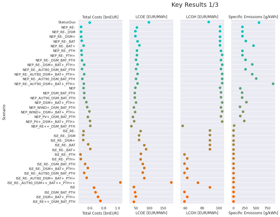
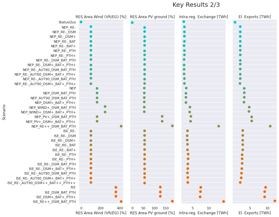
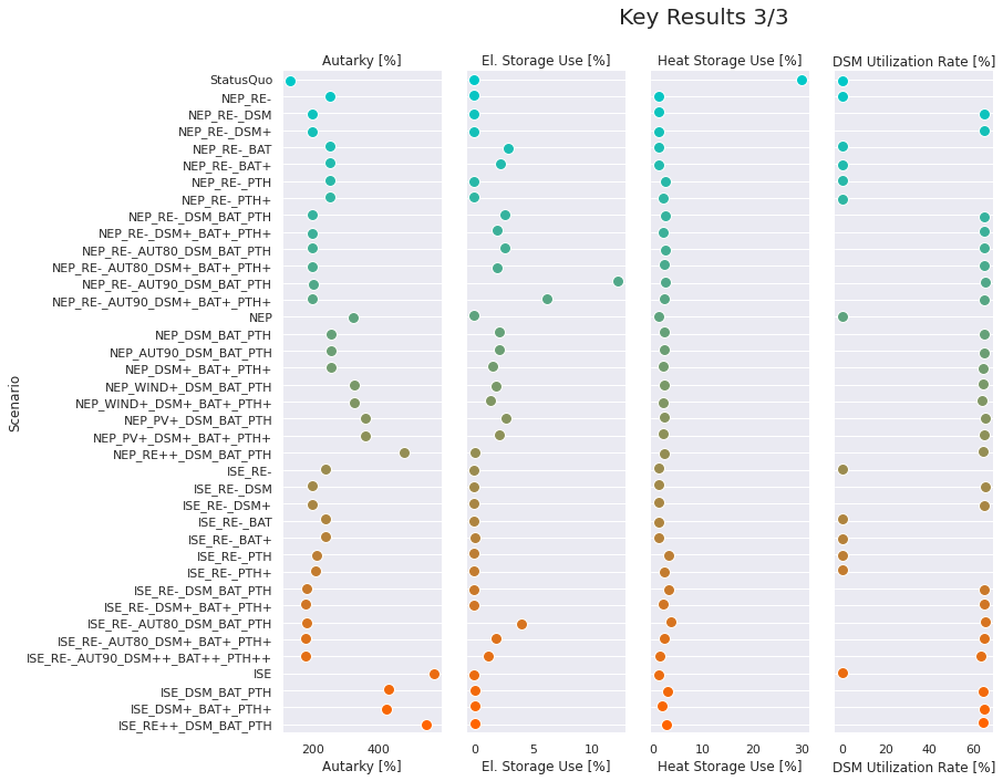
Key results 
The following plots provide the key results of all scenario:
-
Costs and specific emissions
-
Total Costs: Total costs for heat and electricity supply
-
LCOE: Levelized Costs Of Electricity calculation LCOE
-
LCOH: Levelized Costs Of Heat calculation LCOH
-
Specific Emissions: Electrical and Heat Emissions per generated electricity
-
-
Area restrictions and eletricity exchange
-
RES Area Wind (VR/EG): Relative area used for Wind Energy compared to legal StatusQuo more info
-
RES Area PV ground: Relative area used for PV ground compared to StatusQuo more info
-
Intra-reg. Exchange: Accumulated amount of energy exchanged between the municipalities
-
El. Exports: Accumulated electricity exports to the national grid
-
-
Autarky, Storage and DSM
-
Autarky: Ratio of electricity supply and demand calculation of Autarky
-
El. Storage Use: Utilization Rate for electrical Storages calculation of Utilization Rate (Storage)
-
Heat Storage Use: Utilization Rate for heat Storages calculation of Utilization Rate (Storage)
-
DSM Utilization Rate: Utilization Rate for Demand-Side-Management calculation of Utilization Rate (DSM)
-
_* This function is used for plotting._
[4]:
scenario_results = plot_key_scenario_results(results_scns, scenarios, scenario_order=scenario_order)
1 Area required by RES 
1.1 Land-use restrictions and Power Potential in RE Scenarios 
The following plot shows the maximum RES potential for each land-use scenario and technology. Various restrictions can be applied. These land-use scenarios set an upper-limit to the different basic scenarios (NEP/ISE).
Technology-specific restrictions of land use scenarios:
-
Wind
-
Distance to settlements (500m/1000m)
-
use of forests (with: w / without: wo) -percentage of available area due to restrictions resulting from case-by-case decisions (10%)
-
PV ground
-
Restrictions that apply (hard: H / hard+soft: HS)
-
percentage of total available agricultural area as upper limit (0.1% / 1%)
-
PV rooftop
-
Percentage of total potential (50% / 100%)
Note: The specific land use (ha/MWp) of PV are different for 2035 and 2050. For the sake of simplicity, the value of 2050 is used in this plot (cf. assumptions).
Absolute values are represented in colored bars and relative (always relative to the max. installable power for the regulatory status quo) in grey bars. The regulatory status quo is highlighted in bold for each technology.
`This function <https://github.com/windnode/WindNODE_ABW/blob/7e6062e1b9be5f4c1aaa31de6a8fff4b14c995ba/windnode_abw/tools/draw.py#L1279-L1360>`__ is used for plotting.
[5]:
power_pot_land_use(regions_scns, scenarios)

Further on, the following plot shows the maximum installable power for each RE scenario and technology. The land-use scenarios are therefore applied to the basic scenarios NEP and ISE.
RES scenario convertion:
-
RE-
-
Wind capacity limited to designated areas for wind energy (VR/EG).
-
Areas along highways and railway tracks and 0.1 % of agricultural land (strict and weak restrictions apply) are used for PV ground.
-
No restrictions for rooftop PV.
-
RE
-
no restrictions on installable capacity for any RE technology due to available areas. (RE not mentioned in scenario name)
-
WIND+ : (only NEP)
-
Minimum distance to settlements reduced to 500 m and wind installations in forests not allowed.
-
No restrictions for both PV installations.
-
PV+ : (only NEP)
-
No restrictions for wind energy.
-
Areas along highways and railway tracks and 1.0 % of agricultural land (strict and weak restrictions apply) are used for PV ground.
-
50 % of PV rooftop potential
-
RE++ :
-
Minimum distance of wind turbines to settlements reduced to 500 m and wind installations in forests allowed.
-
Areas along highways and railway tracks and max 1.0 % of agricultural land (only strict restrictions).
-
100% of PV rooftop potential
if no restrictions, capacities according to NEP / ISE are used
Absolute values are represented in colored bars and relative values (relative to the max. installable power for the regulatory status quo of 2017) in thin black bars.
`This function <https://github.com/windnode/WindNODE_ABW/blob/7e6062e1b9be5f4c1aaa31de6a8fff4b14c995ba/windnode_abw/tools/draw.py#L1363-L1479>`__ is used for plotting.
[6]:
power_pot_scenarios(regions_scns, scenarios)

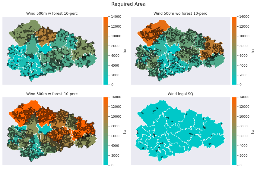
1.2 Available areas: Wind Energy 
The following plots show the available area for wind energy systems after including respective land-use restrictions. A comprehensive description of how those areas are determined see the documentation
-
The black spots mark 100% of the determined available area after land-use restrictions.
-
In this study, we only use 10% of this area for wind turbines as this has proven to be a good approximation for individual case decisions in the region.
-
The resulting amount is represented by the coloration.
[7]:
df_pot_area = pd.DataFrame({scn: area_ha.droplevel(level=1)
              for scn, area_ha
              in regions_scns['StatusQuo'].pot_areas_wec.area_ha.groupby(level=1)})

df_geoms = pd.DataFrame({scn: area_ha.droplevel(level=1)
              for scn, area_ha
              in regions_scns['StatusQuo'].pot_areas_wec.geom.groupby(level=1)})

df_pot_area.drop(columns='s1000f0', inplace=True)
df_geoms.drop(columns='s1000f0', inplace=True)

name_mapping = {'sq': 'Wind legal SQ',
                's1000f1': 'Wind 500m w forest 10-perc',
                's500f0': 'Wind 500m wo forest 10-perc',
                's500f1': 'Wind 500m w forest 10-perc'}

df_pot_area.rename(columns=name_mapping, inplace=True)
df_geoms.rename(columns=name_mapping, inplace=True)

fig, axes = plt.subplots(2, 2, figsize=(12,8))

for ax, (key, data) in  zip(axes.flat, df_pot_area.iteritems()):
    plot_geoplot(key, data, regions_scns['StatusQuo'], ax=ax,
                 unit='ha', cmap=cmap, vmin=0, vmax=14000)

for ax, (key, geoms) in  zip(axes.flat, df_geoms.iteritems()):

    gdf_geoms = geoms.rename('geom').to_frame().dropna()
    gdf_geoms = gdf_geoms['geom'].apply(wkt.loads)
    gdf_geoms = gdf_geoms.rename('geom').to_frame()
    gdf_geoms = gpd.GeoDataFrame(gdf_geoms, geometry='geom')
    gdf_geoms.plot(color='black', edgecolor='black', alpha=0.5, ax=ax)

fig.suptitle('Required Area',
    fontsize=16,
    fontweight='normal')
plt.tight_layout()
plt.show()
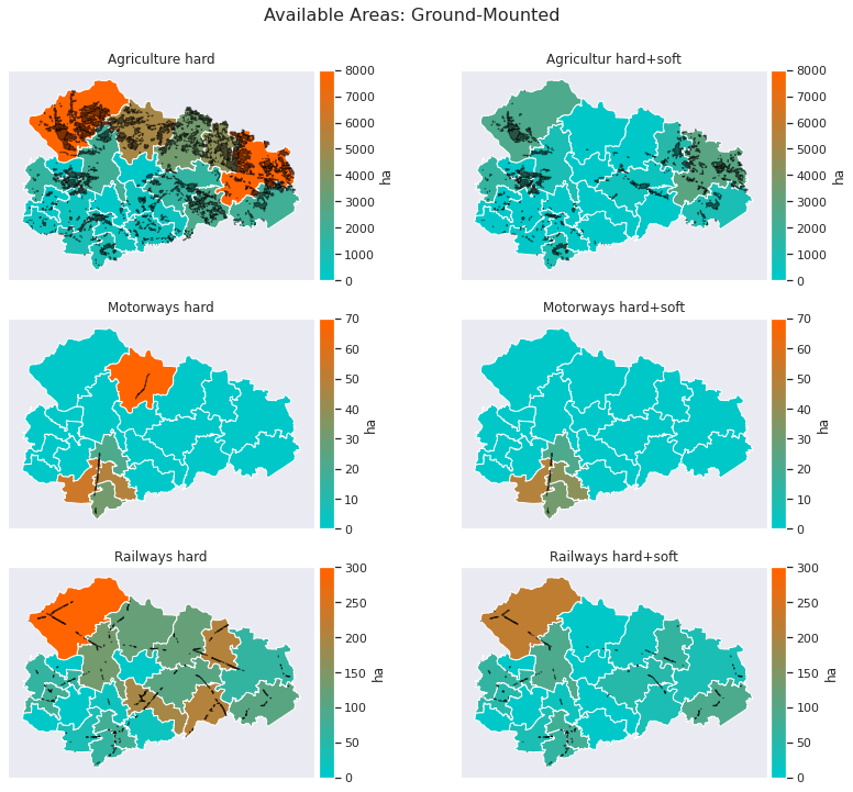
1.3 Available areas: Ground-Mounted PV 
The following plots show the available area for PV ground systems per potential area type after including respective land-use restrictions. A comprehensive description of how those areas are determined see the documentation
-
The black spots mark 100% of the determined available area after land-use restrictions.
-
Depending on the scenario max 0.1% or 1% of the total agricultural area can be used for PV ground systems.
-
The potential areas type are aggregated per land-use scenario.
-
The resulting amount is represented by the coloration.
[8]:
df_pot_area = pd.DataFrame({scn: area_ha.droplevel(level=1)
              for scn, area_ha
              in regions_scns['StatusQuo'].pot_areas_pv.area_ha.groupby(level=1)})

df_geoms = pd.DataFrame({scn: area_ha.droplevel(level=1)
              for scn, area_ha
              in regions_scns['StatusQuo'].pot_areas_pv.geom.groupby(level=1)})

name_mapping = {'agri_h': 'Agriculture hard', 'agri_hs': 'Agricultur hard+soft',
                'bab_h': 'Motorways hard', 'bab_hs': 'Motorways hard+soft',
                'rail_h': 'Railways hard', 'rail_hs': 'Railways hard+soft'}

df_pot_area.rename(columns=name_mapping, inplace=True)
df_geoms.rename(columns=name_mapping, inplace=True)

fig, axes = plt.subplots(3, 2, figsize=(12,10))

vmax = [8000,8000,70,70,300,300]
vmin = [0,0,0,0,0,0]
scale = list(zip(*[vmax, vmin]))

for ax, (key, data), (vmax, vmin) in  zip(axes.flat, df_pot_area.iteritems(), scale):
    plot_geoplot(key, data, regions_scns['StatusQuo'], ax=ax,
                 unit='ha', cmap=cmap, vmin=vmin, vmax=vmax)


for ax, (key, geoms) in  zip(axes.flat, df_geoms.iteritems()):

    gdf_geoms = geoms.rename('geom').to_frame().dropna()
    gdf_geoms = gdf_geoms['geom'].apply(wkt.loads)
    gdf_geoms = gdf_geoms.rename('geom').to_frame()
    gdf_geoms = gpd.GeoDataFrame(gdf_geoms, geometry='geom')
    gdf_geoms.plot(color='black', edgecolor='black', alpha=0.5, ax=ax)

fig.suptitle('Available Areas: Ground-Mounted',
     fontsize=16,
     fontweight='normal',
            y=1)
plt.tight_layout()
plt.show()
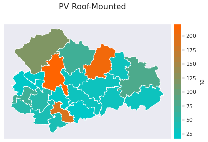
1.4 Available areas: Roof-Mounted PV 
The following plots show the available area for PV roof-mounted systems. There is no specific information about the exact locations of the potential areas.
[9]:
fig, ax = plt.subplots(figsize=(8,4))
df_pot_area = regions_scns['StatusQuo'].pot_areas_pv_roof.sum(axis=1).rename('area')

plot_geoplot(None, df_pot_area, regions_scns['StatusQuo'], ax=ax,
             unit='ha', cmap=cmap)

fig.suptitle('PV Roof-Mounted',
            fontsize=16,
            y=1,
            fontweight='normal')
plt.tight_layout()
plt.show()
2 Demand and Generation 
2.1 Installed Capacities Electricity/Heat 
The following figures show the total installed capacity for both electricity and heat in the ABW-region for each scenario.
[10]:
cap_el = pd.DataFrame({scn: results_scns[scn]['parameters']['Installed capacity electricity supply'].sum(axis=0)
                       for scn in scenarios}).T

cap_el = cap_el.assign(sum=cap_el.sum(axis=1)) \
    .sort_values(by='sum', ascending=False) \
    .drop('sum', axis=1)

fig = go.Figure()

for tech, data in cap_el.iteritems():
    fig.add_trace(go.Bar(x=cap_el.index,
                         y=data,
                         name=PRINT_NAMES[tech],
                         marker=dict(color=COLORS[tech]),
                         hovertemplate='%{y:.1f} MW',
                         showlegend=True))

fig.update_layout(
    title=dict(text='Installed Capacity Electricity Supply',
               y=1),
    barmode='stack',
    hovermode="x unified",
    height=800,
    xaxis=dict(tickfont_size=12,
              categoryorder='array',
              categoryarray=scenario_order,
              tickmode = 'linear',),
    yaxis=dict(title='MW',
               titlefont_size=16,
               tickfont_size=14),
    legend=dict(orientation="h",
                yanchor="bottom",
                y=1.02,
                xanchor="right",
                x=1),
    autosize=True,)

fig.show()

[11]:
cap_th = pd.DataFrame({scn: results_scns[scn]['parameters']['Installed capacity heat supply'].sum(axis=0)
                       for scn in scenarios}).T

cap_th = cap_th.assign(sum=cap_th.sum(axis=1)) \
    .sort_values(by='sum', ascending=False) \
    .drop('sum', axis=1)

fig = go.Figure()
colors_el = [COLORS[c] for c in cap_th.columns]
for tech, data in cap_th.iteritems():
    fig.add_trace(go.Bar(x=cap_th.index,
                         y=data,
                         name=PRINT_NAMES[tech],
                         marker=dict(color=COLORS[tech]),
                         hovertemplate='%{y:.1f} MW',
                         showlegend=True))

fig.update_layout(
    title=dict(text='Installed Capacity Heat Supply',
               y=1),
    barmode='stack',
    hovermode="x unified",
    height=800,
    xaxis=dict(tickfont_size=12,
              categoryorder='array',
              categoryarray=scenario_order,
              tickmode = 'linear',),
    yaxis=dict(title='MW',
               titlefont_size=16,
               tickfont_size=14),
    legend=dict(orientation="h",
                yanchor="bottom",
                y=1.02,
                xanchor="right",
                x=1),
    autosize=True)
fig.show()

2.2 Electricity and Heat Generation 
The following figures show the annual total of genrated electricity or heat for the ABW-region for each scenario.
[12]:
df_gen_el = pd.DataFrame({scn: results_scns[scn]['results_t']['Electricity generation']
                       for scn in scenarios}).T
df_gen_el = df_gen_el / 1e3 #
fig = go.Figure()
for tech, data in df_gen_el.iteritems():
    fig.add_trace(go.Bar(x=df_gen_el.index,
                         y=data,
                         name=tech,
                         marker=dict(color=COLORS_PRINT[tech]),
                         hovertemplate='%{y:.1f} GWh',
                         showlegend=True))

fig.update_layout(
    title=dict(text='Electricity Generation',
               y=1),
    barmode='stack',
    height=800,
    hovermode="x unified",
    xaxis=dict(tickfont_size=12,
              categoryorder='array',
              categoryarray=scenario_order,
              tickmode = 'linear',),
    yaxis=dict(title='GWh',
               titlefont_size=16,
               tickfont_size=14),
    legend=dict(orientation="h",
                yanchor="bottom",
                y=1.02,
                xanchor="right",
                x=1),
    autosize=True)
fig.show()

[13]:
df_gen_heat = pd.DataFrame({scn: results_scns[scn]['results_t']['Heat generation']
                       for scn in scenarios}).T
df_gen_heat = df_gen_heat / 1e3 #
fig = go.Figure()
for tech, data in df_gen_heat.iteritems():
    fig.add_trace(go.Bar(x=df_gen_heat.index,
                         y=data,
                         name=tech,
                         marker=dict(color=COLORS_PRINT[tech]),
                         hovertemplate='%{y:.1f} GWh',
                         showlegend=True))

fig.update_layout(
    title=dict(text='Heat Generation',
               y=1),
    barmode='stack',
    hovermode="x unified",
    height=800,
    xaxis=dict(tickfont_size=12,
              categoryorder='array',
              categoryarray=scenario_order,
              tickmode = 'linear',),
    yaxis=dict(title='GWh',
               titlefont_size=16,
               tickfont_size=14),
    legend=dict(orientation="h",
                yanchor="bottom",
                y=1.02,
                xanchor="right",
                x=1),
    autosize=True)
fig.show()

2.3 Electricity and Heat Demand 
The following figure shows the annual total demand of both electricity and heat for the ABW-region for each scenario.
[14]:
df_el = pd.DataFrame({scn: results_scns[scn]['results_axlxt']['Stromnachfrage nach Gemeinde'].sum()
                       for scn in scenarios}).T
df_heat = pd.DataFrame({scn: results_scns[scn]['results_axlxt']['Wärmenachfrage nach Gemeinde'].sum()
                       for scn in scenarios}).T
df_heat = df_heat.T.groupby([s.split('_')[0] for s in df_heat.columns.values]).sum().T

df_demand = pd.concat([df_el, df_heat], axis=0, keys=['Electricity', 'Heat'], sort=False)
df_demand = df_demand.rename(columns=PRINT_NAMES)
df_demand = df_demand / 1e3

fig = make_subplots(rows=len(scenarios), cols=1, shared_xaxes=True, vertical_spacing=0)
for row, (key, df) in enumerate(df_demand.groupby(level=1)):
    for i, (tech, data) in enumerate(df.iteritems()):
        fig.add_trace(go.Bar(y=list(zip(*data.index.swaplevel())),
                             x=data,
                             name=tech,
                             orientation='h',
                             marker_color=COLORS_PRINT[tech],
                             legendgroup=tech,
                             hovertemplate='%{x:.1f} GWh',
                             showlegend=not bool(row)), row=row+1, col=1)

fig.update_layout(
    title='Demand',
    barmode='stack',
    hovermode="y unified",
    yaxis=dict(tickfont_size=12,
              categoryorder='array',
              categoryarray=scenario_order,
              tickmode = 'linear',),
    height=50*len(scenarios),
    legend= {'tracegroupgap': 0},
    autosize=True)

fig.update_xaxes(title_text="GWH", row=len(scenarios), col=1, matches='x')
fig.show()

3 Energy Exchange and Autarky 
3.1 Energy Exchange 
The following plot show the relations of imported and exported electricity with the national grid.
[15]:
df_exchange = pd.DataFrame({scn:{'import' : results_scns[scn]['flows_txaxt']['Stromerzeugung']['import'].sum(),
                        'export': results_scns[scn]['flows_txaxt']['Stromnachfrage']['export'].sum()}
             for scn in scenarios}).T#.rename(columns=PRINT_NAMES)
df_exchange = df_exchange / 1e3 #GWh

fig = go.Figure()
fig.add_trace(go.Bar(x=df_exchange.index,
                    y=df_exchange['import'],
                    orientation='v',
                    name=PRINT_NAMES['import'],
                     marker_color=colors[0],
                     #opacity=0.5,
                        hovertemplate='%{y:.1f} GWh'))
fig.add_trace(go.Bar(x=df_exchange.index,
                        y=-df_exchange['export'],
                        orientation='v',
                        name=PRINT_NAMES['export'],
                        marker_color=colors[20],
                     #opacity=0.5,
                        hovertemplate='%{y:.1f} GWh'))
fig.update_layout(
    title='Import and Export (National Grid)',
    barmode='relative',
    autosize=True,
    hovermode="x unified",
    xaxis=dict(tickfont_size=12,
              categoryorder='array',
              categoryarray=scenario_order,
              tickmode = 'linear',),
 legend=dict(orientation="h",
                yanchor="bottom",
                y=1.02,
                xanchor="right",
                x=1))
fig.update_yaxes(title='GWh', showspikes=False)
fig.show()

3.2 Autarky 
Annual Autarky describes the ratio of the electricity gerneration to the demand within the region Anhalt-Bitterfeld-Wittenberg (ABW).
Notes on Autarky calculation
-
-
Annual Autarky (ABW): degree of autark electricity supply for ABW disregarding dimension of time
\[Autarky_{Annual,ABW,\%} = \frac{\sum_{t=1}^{8760} E_{supply,mun,t}}{\sum_{t=1}^{8760} E_{demand,mun,t}} \cdot 100\,\%\] -
A further perspective results from the percentage of hours in a year at which the electricity demand is entirely served by local supply.
-
(2) Autark Hours (ABW):
\[Autark\,hours_{Annual,ABW,\%} = \frac{\sum_{t=1}^{8760} (\frac{E_{supply,ABW,t}}{E_{demand,ABW,t}} \geq 1)}{8760} \cdot 100\,\%\]
The electricity that exceeds the local demand can be distributed to the neighboring municipalities and thus contributes to the degree of Autarky of the entire region.
** Only the electrical sector is include in the indicator “Autarky” as there are no transregional heating grids. However, parts of the electrical demand result from “Power-to-Heat” flexibility and is therefore included partially.
[16]:
df_autarky = pd.DataFrame({scn:{'Autarky' : float(results_scns[scn]['highlevel_results']['Autarky']),
                        'Autark Hours': float(results_scns[scn]['highlevel_results']['Autark hours'])}
             for scn in scenarios}).T

fig = make_subplots(rows=2, cols=1, shared_xaxes=True,)

fig.add_trace(go.Bar(x=df_autarky.index,
                    y=df_autarky['Autarky'],
                    orientation='v',
                    name='Autarky',
                     marker_color=colors[0],
                        hovertemplate='%{y:.1f} %'),row=1, col=1, secondary_y=False)
fig.add_trace(go.Bar(x=df_autarky.index,
                        y=df_autarky['Autark Hours'],
                        orientation='v',
                        name='Autark Hours',
                        marker_color=colors[20],
                        hovertemplate='%{y:.1f} %'),row=2, col=1, secondary_y=False)
fig.update_layout(
    title='Autarky',
    barmode='group',
    autosize=True,
    hovermode="x unified",
    xaxis=dict(tickfont_size=12,
              categoryorder='array',
              categoryarray=scenario_order,
              tickmode = 'linear',),
 legend=dict(orientation="h",
                yanchor="bottom",
                y=1.02,
                xanchor="right",
                x=1))
fig.update_yaxes(title='%', showspikes=False)
fig.show()

4 Energy Mix 
The following plot shows the accumulated annual electricity generation and demand of the ABW-Region.
[17]:
df_generation = pd.DataFrame({scn: results_scns[scn]['flows_txaxt']['Stromerzeugung'].sum()
                       for scn in scenarios}).T
df_demand = pd.DataFrame({scn: results_scns[scn]['flows_txaxt']['Stromnachfrage'].sum()
                       for scn in scenarios}).T

fig = go.Figure()
for tech, data in df_generation.iteritems():
    fig.add_trace(go.Bar(x=data.index,
                            y=data / 1e3,
                            orientation='v',
                            name=PRINT_NAMES[tech],
                             marker_color=COLORS[tech],
                            hovertemplate='%{y:.1f} GWh'))

for tech, data in df_demand.iteritems():
    fig.add_trace(go.Bar(x=data.index,
                            y=-data / 1e3,
                            orientation='v',
                            name=PRINT_NAMES[tech],
                            marker_color=COLORS[tech],
                            hovertemplate='%{y:.1f} GWh',))

fig.update_layout(
    title=dict(text='Power Generation and Demand',
               y=1),
    legend=dict(orientation="h",
                yanchor="bottom",
                y=1.02,
                xanchor="right",
                x=1),
    barmode='relative',
    height=900,
    autosize=True,
    hovermode="x unified",
    xaxis=dict(tickfont_size=12,
              categoryorder='array',
              categoryarray=scenario_order,
              tickmode = 'linear',),
)
fig.update_yaxes(title='GWh', showspikes=False)
fig.show()

4.2 Heat Generation and Demand 
The following plot shows the accumulated annual heat generation and demand of the ABW-Region.
[18]:
df_generation = pd.DataFrame({scn: results_scns[scn]['flows_txaxt']['Wärmeerzeugung'].sum()
                       for scn in scenarios}).T#ename(columns=PRINT_NAMES)
df_demand = pd.DataFrame({scn: results_scns[scn]['flows_txaxt']['Wärmenachfrage'].sum()
                       for scn in scenarios}).T#.rename(columns=PRINT_NAMES)
df_generation = df_generation / 1e3
df_demand = df_demand / 1e3

fig = go.Figure()
for tech, data in df_generation.iteritems():
    fig.add_trace(go.Bar(x=data.index,
                            y=data,
                            orientation='v',
                            name=PRINT_NAMES[tech],
                             marker_color=COLORS[tech],
                            hovertemplate='%{y:.1f} GWh'))

for tech, data in df_demand.iteritems():
    fig.add_trace(go.Bar(x=data.index,
                            y=-data,
                            orientation='v',
                            name=PRINT_NAMES[tech],
                            marker_color=COLORS[tech],
                            hovertemplate='%{y:.1f} GWh',))


fig.update_layout(
    title=dict(text='Heat Generation and Demand',
               y=1),
    legend=dict(orientation="h",
                yanchor="bottom",
                y=1.02,
                xanchor="right",
                x=1),
    barmode='relative',
     height=800,
    autosize=True,
    hovermode="x unified",
    xaxis=dict(tickfont_size=12,
              categoryorder='array',
              categoryarray=scenario_order,
              tickmode = 'linear',),)
fig.update_yaxes(title='GWh', showspikes=False)
fig.show()

5 Emissions 
5.1 Emissions absolute 
The following plot show the total accumulated CO2 emissions per sector/technology for each scenario.
[19]:
df_emissions = pd.DataFrame(
    {scn : pd.concat([pd.Series(data=results_scns[scn]['results_axlxt'][key].sum().sum(), index=[key]) \
                      for key in results_scns[scn]['results_axlxt'] if 'total' in key]) \
     for scn in scenarios}).T

df_emissions['CO2 emissions grid total'] = df_emissions[['CO2 emissions grid total',
                                                         'CO2 emissions grid new total']]
df_emissions = df_emissions.drop(columns='CO2 emissions grid new total')

fig = go.Figure()
for i, (tech, data) in enumerate(df_emissions.iteritems()):
    fig.add_trace(go.Bar(x=data.index,
                         y=data,
                         name=tech,
                         orientation='v',
                         marker_color=colors[5*i],
                         legendgroup=tech,
                         hovertemplate='%{y:.1f} t CO2',))
fig.update_layout(
    title='Emissions',
    barmode='stack',
    hovermode="x unified",
    height=600,
    autosize=True,
    xaxis=dict(tickfont_size=12,
              categoryorder='array',
              categoryarray=scenario_order,
              tickmode = 'linear',),
    legend=dict(orientation="h",
                yanchor="bottom",
                y=1.02,
                xanchor="right",
                x=1,
               tracegroupgap=0))

fig.update_yaxes(title_text="t CO2")
fig.show()

6 Costs 
6.1 Costs per Sector and Technology 
The following plots show the accumulated total costs per technology for both heat and electricity sector. The total cost include fixed, variable cost as welll as CO2 certificat prices.
[20]:
df_cost_el = pd.DataFrame({scn: results_scns[scn]['results_t']['Total costs electricity supply']
                       for scn in scenarios}).T#.rename(columns=PRINT_NAMES)
df_cost_el = df_cost_el/ 1e6 # to Million €

fig = go.Figure()

for tech, data in df_cost_el.iteritems():
    fig.add_trace(go.Bar(x=df_cost_el.index,
                         y=data,
                         name=PRINT_NAMES[tech],
                         marker=dict(color=COLORS[tech]),
                         hovertemplate='%{y:.1f} M €',
                         showlegend=True))

fig.update_layout(
    title=dict(text='Total electrical costs distribution per technology', y=1),
    legend=dict(orientation="h", yanchor="bottom", y=1.02, xanchor="right", x=1),
    barmode='stack',
    hovermode="x unified",
    height=800,
    xaxis=dict(tickfont_size=12, categoryorder='array',
              categoryarray=scenario_order,
              tickmode = 'linear',),
    yaxis=dict(title='M €', titlefont_size=16, tickfont_size=14),
    autosize=True,)

fig.show()

[21]:
df_cost_th = pd.DataFrame({scn: results_scns[scn]['results_t']['Total costs heat supply']
                       for scn in scenarios}).T#.rename(columns=PRINT_NAMES)
df_cost_th = df_cost_th/ 1e6 # to Million €

fig = go.Figure()

for tech, data in df_cost_th.iteritems():
    fig.add_trace(go.Bar(x=df_cost_th.index,
                         y=data,
                         name=PRINT_NAMES[tech],
                         marker=dict(color=COLORS[tech]),
                         hovertemplate='%{y:.1f} M €',
                         showlegend=True))

fig.update_layout(
    title=dict(text='Total thermal costs distribution per technology', y=1),
    legend=dict(orientation="h", yanchor="bottom", y=1.02, xanchor="right", x=1),
    barmode='stack',
    hovermode="x unified",
    height=800,
    xaxis_tickfont_size=12,
    xaxis=dict(tickfont_size=12, categoryorder='array',
              categoryarray=scenario_order,
              tickmode = 'linear',),
    yaxis=dict(title='M €', titlefont_size=16, tickfont_size=14),
    autosize=True,)
fig.show()

6.2 LCOE, LCOH and Renewable Share 
The following plot shows the levelized cost of electricity and heat in comparisson to the RE share. The RE share is the ratio of total generated electricity of renewable energy and the total demand for each scenario.
Notes on LCOE calculation
-
Total LCOE calculate as \(LCOE=\frac{expenses_{el.total}}{demand_{el.,total}}\) , likewise total LCOH calculate as \(LCOH=\frac{expenses_{th.,total}}{demand_{th.,total}}\)
-
Total expenses \(expenses_{el.total}\) are annual expenses. Investment costs are discounted to one year using equivalent periodic costs
[22]:
scenario_results_ext = scenario_results[1].join(
    scenario_results[2].drop("Scenario", axis=1)).join(
    scenario_results[3].drop("Scenario", axis=1)).copy()

tmp_dict = {
    "RES share [%]": [],
    "Autark hours [%]": [],
    'Heat Storage Use [GWh]': [],
    'El. Storage Use [GWh]': [],
    'Net DSM activation [GWh]': []
}
for scenario in scenarios:
    tmp_dict["RES share [%]"].append(results_scns[scenario]["results_t"]['Electricity generation'].drop(
        ["Large-scale CHP", "Open-cycle gas turbine", "Combined-cycle gas turbine"]).sum() / float(results_scns[scenario]["highlevel_results"]["Electricity demand total"]) * 100)
    tmp_dict["Autark hours [%]"].append(float(results_scns[scenario]["highlevel_results"]["Autark hours"]) * 100)
    tmp_dict['Heat Storage Use [GWh]'].append(results_scns[scenario]["results_axlxt"]['Wärmespeicher nach Gemeinde'].sum().sum() / 1e3)
    tmp_dict['El. Storage Use [GWh]'].append(results_scns[scenario]["results_axlxt"]['Batteriespeicher nach Gemeinde'].sum().sum() / 1e3)
    tmp_dict['Net DSM activation [GWh]'].append(float(results_scns[scenario]["highlevel_results"]['Net DSM activation']) / 1e3)
additional_key_figures = pd.DataFrame(tmp_dict, index=scenarios)
scenario_results_ext = scenario_results_ext.join(additional_key_figures, on="Scenario").set_index("Scenario").sort_values("RES share [%]")
scenario_results_ext = scenario_results_ext.drop("StatusQuo", axis=0)

fig = make_subplots(specs=[[{"secondary_y": True}]])

re_scn_matches = [re.search('((RE\+\+)|(RE\+)|(WIND\+)|(PV\+)|(RE-)|(RE))', scn) for scn in scenario_results_ext.index]
scenario_results_ext["RE scenario"] = [m[0] if m is not None else "RE" for m in re_scn_matches]

re_scn_sort = {"RE-": 0, "RE": 1, "WIND+": 2, "PV+":3, "RE++": 4}
scenario_results_ext["RE scenario order"] = scenario_results_ext["RE scenario"].replace(re_scn_sort)
scenario_results_ext = scenario_results_ext.sort_values(["RE scenario order", "RES share [%]"])
xlabels = [["<b>{}</b>".format(_) for _ in scenario_results_ext["RE scenario"]], scenario_results_ext.index]

fig.add_trace(go.Bar(y=scenario_results_ext["RES share [%]"],
            x=xlabels,
            name="RES share",
            marker_color=colors[0],
            hovertemplate='%{y:.2f}%',
            showlegend=True))

fig.add_trace(go.Scatter(y=scenario_results_ext["LCOE [EUR/MWh]"],
                             x=xlabels,
                             mode='markers',
                             #opacity=0.7,
                             marker=dict(color=colors[20], symbol='diamond-wide'),
                             name="LCOE",
                         hovertemplate='%{y:.2f} €/MWh',
                             ), secondary_y=True)

fig.add_trace(go.Scatter(y=scenario_results_ext["LCOH [EUR/MWh]"],
                             x=xlabels,
                            mode='markers',
                             #opacity=0.7,
                             marker=dict(color=colors[20],
                                         symbol='diamond-tall',),
                             name="LCOH",
                         hovertemplate='%{y:.2f} €/MWh',
                             ), secondary_y=True)


fig.update_layout(title=dict(text='Integration of RE and LCOE/H'),
                  yaxis=dict(
                      title="RES share in %",
                      titlefont_size=16,
                      tickfont_size=12),
                  height=700,
                  width=900,
                  autosize=True,
                  hovermode="x unified",
                  legend=dict(orientation="h", yanchor="bottom",y=1.02, xanchor="right",x=1)
                 )
fig.update_yaxes(title_text="LCOE/LCOH in EUR/MWh", secondary_y=True)
fig.update_xaxes(tickmode = 'linear',)

7 Power Grid 
The following plot shows the distribution of the maximum line loading of all lines in the ABW-Region for each scenario. Each timestep, only one line with the maximum value is represented. Therefore this plot only shows the worst-case line per timestep and neglects the remaining lines. Thus it can only be an indicator for high line loadings and give a vague overview about the grid situation.
[23]:
df_line_loading = pd.DataFrame({scn: results_scns[scn]['flows_txaxt']['Line loading'].max(level='timestamp')*100
                       for scn in scenarios})#.rename(columns=PRINT_NAMES)
df_line_loading = df_line_loading.reindex(columns=scenario_order)
fig = go.Figure()
for i, (group, data) in enumerate(df_line_loading.iteritems()):
    fig.add_trace(go.Box(
        y=data.values,
        name=group,
        boxmean=True,
        boxpoints=False,
        marker_color=set_colors(39)[1][i],
        showlegend=False))

#fig.update_traces(orientation='h')#, side='positive', width=2, points=False)
fig.update_yaxes(title='%',showspikes=True)
fig.update_xaxes(type='category', tickmode = 'linear',)
fig.update_layout(
    title='Max Lines Loading Distribution', height=800,
    yaxis_showgrid=False, yaxis_zeroline=True, hovermode="x unified",
                 xaxis=dict(tickfont_size=12,
              categoryorder='array',
              categoryarray=scenario_order),)

fig.show()

8 Flexibility 
Notes on the Calculation Flexibility Indicator:
-
-
Annual Autarky (ABW): degree of autark electricity supply for ABW disregarding dimension of time
\[Autarky_{Annual,ABW,\%} = \frac{\sum_{t=1}^{8760} E_{supply,mun,t}}{\sum_{t=1}^{8760} E_{demand,mun,t}} \cdot 100\,\%\] -
-
-
Autark Hours (ABW):
\[Autark\,hours_{Annual,ABW,\%} = \frac{\sum_{t=1}^{8760} (\frac{E_{supply,ABW,t}}{E_{demand,ABW,t}} \geq 1)}{8760} \cdot 100\,\%\] -
-
-
Utilization Rate (Storage):
-
The Ratio of \(Total Cycles_{technology}\) to \(Max Cycles_{technology}\)
with
-
-
Utilization Rate (DSM):
-
The Ratio of Net activation to DSM Capacity
The following plot shows the percentage of autark hours a year in relation to the utilization rate of multiple flexibility options.
[24]:
fig = make_subplots(specs=[[{"secondary_y": True}]])

scenario_results_ext = scenario_results_ext.sort_values(["RE scenario order", "Autark hours [%]"])
xlabels = [["<b>{}</b>".format(_) for _ in scenario_results_ext["RE scenario"]], scenario_results_ext.index]

fig.add_trace(go.Bar(y=scenario_results_ext["Autark hours [%]"],
            x=xlabels,
            name="Autark hours in %",
           marker_color=colors[0],
            hovertemplate='%{y:.2f} %',
            showlegend=True))

fig.add_trace(go.Scatter(y=scenario_results_ext['El. Storage Use [%]'],
                            x=xlabels,
                            mode='markers',
                            #opacity=0.7,
                            marker_color="grey",
                            marker_symbol='diamond-wide',
                            hovertemplate='%{y:.2f} %',
                            name="Battery storage utilization in %",
                             ), secondary_y=True)

fig.add_trace(go.Scatter(y=scenario_results_ext['Heat Storage Use [%]'],
                            x=xlabels,
                            mode='markers',
                            marker_color="indianred",
                            marker_symbol='star-diamond',
                            #opacity=0.7,
                            hovertemplate='%{y:.2f} %',
                            name="Heat storage utilization in %",
                             ), secondary_y=True)

fig.add_trace(go.Scatter(y=scenario_results_ext['DSM Utilization Rate [%]'],
                            x=xlabels,
                            mode='markers',
                            #opacity=0.7,
                            marker_symbol='star-square',
                            marker_color="darkorange",
                            hovertemplate='%{y:.2f} %',
                            name="DSM utilization in %",
                             ), secondary_y=True)

fig.update_layout(title=dict(text='Autarky, Utilization of Storage and DSM'),
                  yaxis=dict(
                      title="Autark hours in %",
                      titlefont_size=16,
                      tickfont_size=12),
                  height=800,
                  width=900,
                  autosize=True,
                  hovermode="x unified",
                  legend=dict(orientation="h", yanchor="bottom",y=1.02, xanchor="right",x=1)
                 )
fig.update_yaxes(title_text="Utilization in %", secondary_y=True)
fig.update_xaxes(tickmode = 'linear',)

The following plot shows the percentage of autark hours a year in relation to amount of shifted energy of multiple flexibility options.
[25]:
fig = make_subplots(specs=[[{"secondary_y": True}]])

scenario_results_ext = scenario_results_ext.sort_values(["RE scenario order", "Autark hours [%]"])
xlabels = [["<b>{}</b>".format(_) for _ in scenario_results_ext["RE scenario"]], scenario_results_ext.index]

fig.add_trace(go.Bar(y=scenario_results_ext["Autark hours [%]"],
            x=xlabels,
            name="Autark hours in %",
            marker_color=colors[0],
            hovertemplate='%{y:.2f} %',
            showlegend=True))

fig.add_trace(go.Scatter(y=scenario_results_ext['El. Storage Use [GWh]'],
                            x=xlabels,
                            mode='markers',
                            #opacity=0.7,
                            marker_color="grey",
                            marker_symbol='diamond-wide',
                            hovertemplate='%{y:.2f} GWh',
                            name="Shifted electricity battery storage in GWh",
                             ), secondary_y=True)

fig.add_trace(go.Scatter(y=scenario_results_ext['Heat Storage Use [GWh]'],
                            x=xlabels,
                            mode='markers',
                            #opacity=0.7,
                            marker_symbol='star-diamond',
                            marker_color="indianred",
                            hovertemplate='%{y:.2f} GWh',
                            name="Shifted electricity heat storage in GWh",
                             ), secondary_y=True)

fig.add_trace(go.Scatter(y=scenario_results_ext['Net DSM activation [GWh]'],
                            x=xlabels,
                            mode='markers',
                            #opacity=0.7,
                            marker_symbol='star-square',
                            marker_color="darkorange",
                            hovertemplate='%{y:.2f} GWh',
                            name="Shifted electricity DSM in GWh",
                             ), secondary_y=True)


fig.update_layout(title=dict(text='Autarky, Amount of Storage and DSM', y=.97),
                  yaxis=dict(
                      title="Autark hours in %",
                      titlefont_size=16,
                      tickfont_size=12),
                  height=700,
                  autosize=True,
                  hovermode="x unified",
                  legend=dict(orientation="h", yanchor="bottom", y=1.02, xanchor="right", x=1)
                 )
fig.update_yaxes(title_text="Shifted electricity in GWh", secondary_y=True)
fig.update_xaxes(tickmode = 'linear',)

The following plot shows the share of renawbles in relation to the utilization rate of multiple flexibility options.
[26]:
fig = make_subplots(specs=[[{"secondary_y": True}]])

scenario_results_ext = scenario_results_ext.sort_values(["RE scenario order", "RES share [%]"])
xlabels = [["<b>{}</b>".format(_) for _ in scenario_results_ext["RE scenario"]], scenario_results_ext.index]

fig.add_trace(go.Bar(y=scenario_results_ext["RES share [%]"],
            x=xlabels,
            name="RES share in %",
            marker_color=colors[0],
            hovertemplate='%{y:.2f} %',
            showlegend=True))

fig.add_trace(go.Scatter(y=scenario_results_ext['El. Storage Use [%]'],
                            x=xlabels,
                            mode='markers',
                            #opacity=0.7,
                            marker_color="grey",
                            marker_symbol='diamond-wide',
                            name="Battery storage utilization in %",
                            hovertemplate='%{y:.2f} %',
                             ), secondary_y=True)

fig.add_trace(go.Scatter(y=scenario_results_ext['Heat Storage Use [%]'],
                            x=xlabels,
                            mode='markers',
                            #opacity=0.7,
                            marker_color="indianred",
                            marker_symbol='star-diamond',
                            name="Heat storage utilization in %",
                            hovertemplate='%{y:.2f} %',
                             ), secondary_y=True)

fig.add_trace(go.Scatter(y=scenario_results_ext['DSM Utilization Rate [%]'],
                            x=xlabels,
                            mode='markers',
                            #opacity=0.7,
                            marker_symbol='star-square',
                            marker_color="darkorange",
                            name="DSM utilization in %",
                            hovertemplate='%{y:.2f} %',
                             ), secondary_y=True)


fig.update_layout(title=dict(text='RE Share, Utilization of Storage and DSM', y=.97),
                  yaxis=dict(title="RE share in %", titlefont_size=16, tickfont_size=12),
                  height=700,
                  autosize=True,
                  hovermode="x unified",
                  legend=dict(orientation="h", yanchor="bottom",y=1.02, xanchor="right",x=1)
                 )
fig.update_yaxes(title_text="Utilization in %", secondary_y=True)
fig.update_xaxes(tickmode = 'linear',)
